Design comparison
Solution retrospective
Feedback or comments are welcome :D
Community feedback
- @AlexKMarshallPosted about 3 years ago
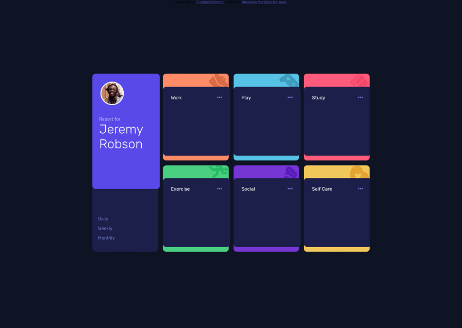
Hey, at desktop sizes this looks good. Though I was a bit confused why all the information was missing. It would be worth having a default view selected rather than showing a blank screen until someone clicks on daily/weekly/monthly
Unfortunately, it's not responsive to different screen sizes at all. If I resize below approximately 1200px width, it breaks completely, and below about 900px it becomes unusable. This is mainly because of using dimensions on containers that are not based on the content-size.
I think it would be worth tackling some of the newbie challenges, and really focus on making the design work mobile-first, and testing across all sizes of screens.
Marked as helpful0@abmartinezmPosted about 3 years ago@AlexKMarshall Hi. first of all thank you for the comment. I was approaching every challenge only doing it for the widths mentioned in the style-guide which were 1440px and 375px so that is why it is not responsive to other screen sizes. I will make them responsive to the different sizes and practice that concept more :). Regards
0 - @abmartinezmPosted about 3 years ago
Also the movile version works fine but as I wrote the code in a different styles sheet it does not display in the one uploaded as i forgot to put both codes together
0
Please log in to post a comment
Log in with GitHubJoin our Discord community
Join thousands of Frontend Mentor community members taking the challenges, sharing resources, helping each other, and chatting about all things front-end!
Join our Discord
