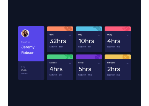
Responsive Time Tracking Dashboard with React and Chakra Ui

Solution retrospective
Hello everyone!
I had a lot of fun finding my way through this dashboard challenge. I decided to use React and Chakra-ui as my go-to for it and it gave me an opportunity to really get better at both.
I am still unsure about the best way to change the background color of the activity cards on hover. So for now the background stays the same lol. I also want to break a few more things into their own components to make the code base more elegant and readable.
I guess my main question would what is the best practice when it comes to hover states for react? any answers and critique of my work would be greatly appreciated.
Please log in to post a comment
Log in with GitHubCommunity feedback
No feedback yet. Be the first to give feedback on Sheelove Dol's solution.
Join our Discord community
Join thousands of Frontend Mentor community members taking the challenges, sharing resources, helping each other, and chatting about all things front-end!
Join our Discord