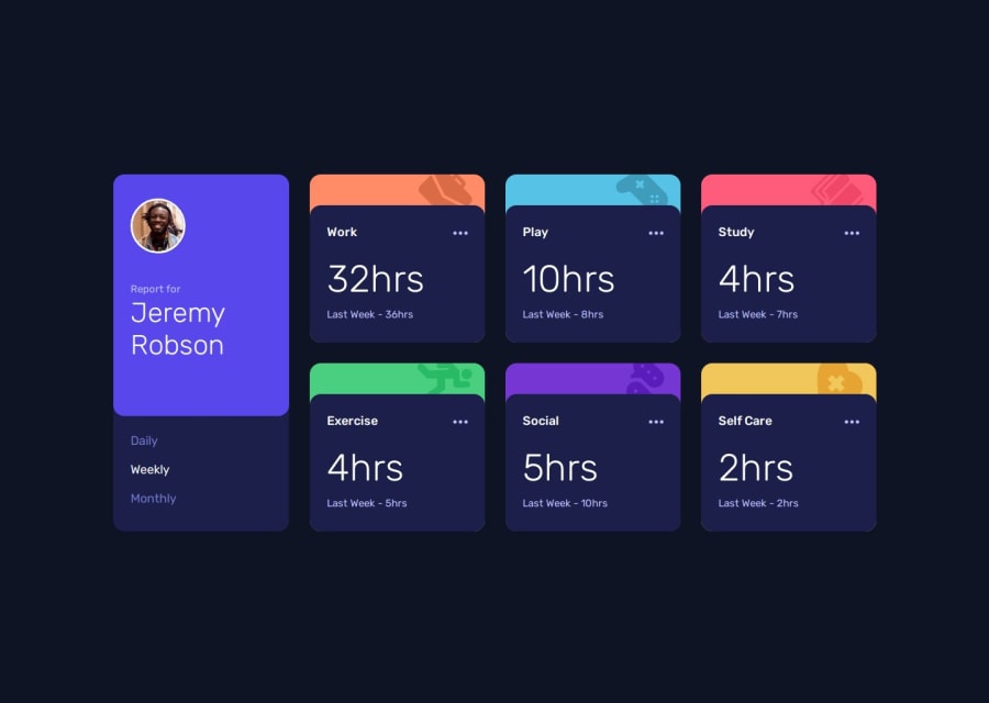
Responsive Time Tracking Dashboard Using SCSS and JS


Design comparison

Solution retrospective
I'm glad that I was able to implement the UI changes based on data.
What challenges did you encounter, and how did you overcome them?As always, I still struggle with making the page responsive. So far, I'm still using the media queries but I'm not sure if that's the best solution.
I also had problems with accessing the data.json file when I deployed on GitHub Pages. It turned out I just need to change the path to be "./data.json".
What specific areas of your project would you like help with?- I'm not sure if what I did for the ellipsis svg using img tags is correct.
- I'm not sure if the ellipsis should be clickable or hoverable. Also, I'm not sure about the expected behavior when the ellipsis is hovered.
I would very much appreciate any suggestions that could improve my skills.
Thank you!
Community feedback
- @jadeli1720Posted 12 days ago
Hello there! Your code is clean, DRY, and easy to follow—great job!
Regarding page responsiveness, media queries are typically used to ensure the layout adjusts across different screen sizes. If you plan on revisiting this challenge, a fun next step could be to dynamically create each
<li>element using JavaScript, instead of manually typing each one out in the HTML.Again, great work, and I hope you find this suggestion helpful!
0

Please log in to post a comment
Log in with GitHub
Join our Discord community
Join thousands of Frontend Mentor community members taking the challenges, sharing resources, helping each other, and chatting about all things front-end!
Join our Discord