Not Found
Not Found
Not Found
Not Found
Not Found
Not Found
Not Found
Not Found
Not Found
Not Found
Not Found
Not Found
Not Found
Not Found
Not Found
Not Found
Not Found
Not Found
Not Found
Not Found

Submitted

Responsive time tracking dashboard using HTML, CSS and JavaScript

OLUMIDE MICHEALโ€ข 270

@codewithmide

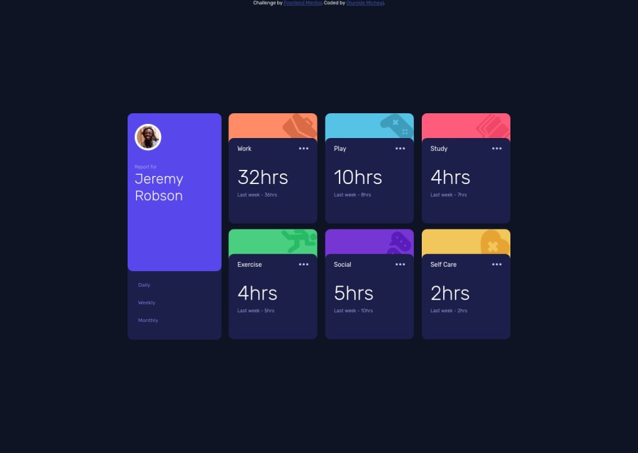
Desktop design screenshot for the Time tracking dashboard coding challenge

This is a solution for...

  • HTML
  • CSS
  • JS
2junior
View challenge

Design comparison


SolutionDesign

Solution retrospective


My first junior level project that I built from scratch to finish without having to watch tutorials on js

Community feedback

romilaโ€ข 3,570

@romila2003

Posted

Hi Olumide,

Congratulations ๐ŸŽ‰ for completing this challenge, your Time tracking dashboard looks great and is functional. Also, it is great that you used the right semantic for your code. It is great that you were able to do this from scratch without a tutorial. I have some suggestions I want to address:

It is best practice to wrap the footer within the footer tag e.g. <footer class="attribution"></footer>

JS: Regarding your JS, you could use the querySelectorAll() attribute by giving all of the hours, the same class and all of the last week hours, the same class, where you could insert the class into this attribute e.g.

const numbers = document.querySelectorAll(".numbers");
const hours = document.querySelectorAll(".hours");

From there, you can use a for loop that will go through each box and insert the data in the right order e.g.

const dailyBtn = = document.getElementById("daily");

dailyBtn.addEventListener("click", () => {
        for(let i = 0; i < numbers.length; i++) {
            numbers[i].innerHTML = data[i].timeframes.daily.current + "hrs";
            hours[i].innerHTML = data[i].timeframes.daily.previous + "hrs";
        };
    });

If you do not know what a for loop is, I can give a brief explanation. A for loop contains 3 things, the initial value, the end value and the steps from the beginning to the end. Initially, the value of i is set to 0 and the final value of i will be less than the length of our .numbers which is 6 in our case as there is only 6 boxes. For reference, incrementing numbers is when numbers go up by one and it keeps adding its previous number e.g. 0 + 1 = 1, 1 + 1 = 2, 2 + 1 = 3. In this case, i starts with 0 and will keep adding 1 to its previous self until it reaches the length of .numbers which is 6. We include i into our numbrs, hours and data so that the JSON data loops through the hours and last week hours, in our HTML and CSS.

Sorry, if this sounds confusing and long however once you get the gist of it, it will be easier to consume. Also, it will be easier when dealing with large data and forms since you can just loop through the inputs.

Overall, great work and wish you the best for your future projects so keep coding ๐Ÿ‘.

Marked as helpful

1

OLUMIDE MICHEALโ€ข 270

@codewithmide

Posted

@romila2003 Thank you so much for this!! even though it looks a lot to digest๐Ÿ˜‚, I will still take action on every single point mentioned here.

Of course I know about the for loop, the reason I didn't use it is because some of the hours are 0's and 1's. for such numbers, I can't use the +"hrs" with them, it will result in a typo error. but i really appreciate you for taking your time to review my code๐Ÿ™Œ

1
Elaineโ€ข 11,400

@elaineleung

Posted

Hi Olumide, I think this is a great attempt in solving this challenge, and well done in doing everything yourself without tutorials!

I think the main feedback I have is to try to use flexbox and grid to position the component instead of using position: absolute, which would make the component hard to be resized, and when the browser is made smaller at around the 1050px breaktpoint, the cards start to look really squished and the text is spilling out of the container. Using absolute positioning is also the reason the footer is placed at the top because the main component got taken out of its relative context and then took on absolute positioning; for the other children at that same level (such as the footer), they would then position themselves as if the other element is not there at all.

You can see whether my solution here can give you some ideas on how to position the element: https://www.frontendmentor.io/solutions/responsive-dashboard-using-scss-and-vanilla-javascipt-with-json--HVkNhdtJT

Once again, great work overall in doing this on your own!

Marked as helpful

1

OLUMIDE MICHEALโ€ข 270

@codewithmide

Posted

@elaineleung Thank you for the correction. I will take them into account and make the necessary changes now. I really appreciate!

0
OLUMIDE MICHEALโ€ข 270

@codewithmide

Posted

@elaineleung I have fixed the position absolute and the breakpoint issue. Thank you once more๐Ÿ‘

0

Please log in to post a comment

Log in with GitHub
Discord logo

Join our Discord community

Join thousands of Frontend Mentor community members taking the challenges, sharing resources, helping each other, and chatting about all things front-end!

Join our Discord