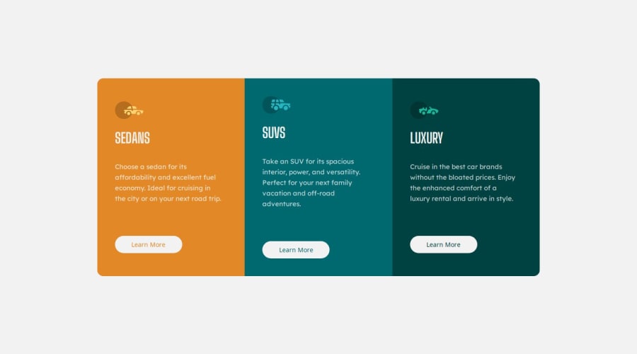
Design comparison
Solution retrospective
Proud of:
- Responsive Design: Successfully implemented a responsive design that adjusts well to different screen sizes, ensuring a good user experience on mobile, tablet, and desktop devices.
- Visual Consistency: Achieved a visually appealing and consistent design by utilizing custom CSS variables for colors, fonts, and border radii, which made the styling easier to manage and update.
- Hover Effects: Created interactive hover effects on the buttons, enhancing the user experience by providing visual feedback.
Challenges:
Responsive Design Implementation: Ensuring that the design looked good on various screen sizes was challenging. It required thorough testing and tweaking of media queries to achieve a consistent look and feel.
Solution: Used CSS Grid and Flexbox to create a flexible layout that adjusts smoothly across different devices. Tested extensively on various screen sizes to ensure responsiveness. Hover Effects Consistency: Ensuring that the hover effects on buttons were consistent and visually appealing across different sections.
Solution: Created separate classes for each button's hover effect and ensured they were consistent by using CSS variables for colors and other properties.
Community feedback
Please log in to post a comment
Log in with GitHubJoin our Discord community
Join thousands of Frontend Mentor community members taking the challenges, sharing resources, helping each other, and chatting about all things front-end!
Join our Discord
