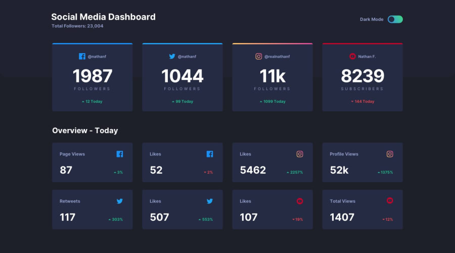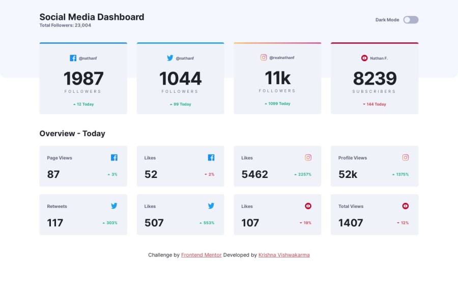
Responsive Theme Based Social Media Dashboard With Theme Switcher
Design comparison
Solution retrospective
Hi, Mentors
What users can do
- View the optimal layout for the site depending on their device's screen size
- See hover states for all interactive elements on the page
- Toggle color theme to their preference
- Bonus: As per their computer preferences of the color scheme they will have the default theme automatically activated.
Built with
- Semantic HTML5 markup
- CSS custom properties
- CSS Flexbox
- CSS Grid
- Mobile-first workflow
- Browser Local storage to store user theme preferences
All comments are welcome. Thanks!
Happy mentoring
Community feedback
- P@FluffyKasPosted about 1 year ago
Heyo,
It looks really very neat, kinda pixel-perfect! Awesome that it detects OS settings and you even set the chosen theme in local storage. Accessibility wise, there's some room for improvement. There's a few things you could do, for example:
- Your theme switch is just an svg, not a fully functional switch. Regardless of the theme setting, the button of the switch will always return to the left if I refresh the page. Also, it can't be focused (so no keyboard navigation), and pretty much inaccessible for screen readers too. There are a few ways to approach this problem, but for example, here's a really awesome article about accessible switches that might be helpful. If you're using a framework and don't want to build your own accessible switch from scratch (which is pretty valid, ngl), there are solutions for that too. My personal favourite is shadcn, although this is React-specific but super easy to use. I'm sure there are other good solutions out there too.
- Alt texts: images that are decorative should have a blank alt text. Just think about it: "Icon Up Green" or "Icon Twitter" doesn't convey a lot of information to the user, does it?
- I would also think about the purpose of these social media cards. You put a cursor: pointer on them, so I'm assuming they are links leading somewhere. If this is the case, you should indeed wrap them in links. If you wrap them in links, those should have an aria-label stating where they lead (Twitter, FB, etc). Maybe a screen reader only title would also be useful for each card.
Another thing that isn't accessibility-related: decide on a naming convention for your classes and stick to it. Right now there are both kebab case ("d-flex justify-content-between") and snake case ("social_icon_top_card") classes. I'd say kebab case is the most frequently used for css class naming, but if you prefer something else, go for it, just stick to it consistently.
Overall, I think you did great. There's just some accessibility issues to work through, but that's always a long learning process (: Hope I managed to help a bit.
Marked as helpful1P@KrishnaVishwakarma1595Posted about 1 year agoHey @FluffyKas ,
Thanks for the feedback, it's really helpful for me. I'll definitely remember them and try to do with my upcoming challenges.
About the naming conventions for the classes, I agree with your point I must stick to its consistency. However, I prefer the snake case most of the time for the naming conventions for the classes. I used
Bootstrap CSS framework
and this kebab case ("d-flex justify-content-between") classes are its pre-defined classes.Thanks for the wonderful feedback. Happy Coding!
0
Please log in to post a comment
Log in with GitHubJoin our Discord community
Join thousands of Frontend Mentor community members taking the challenges, sharing resources, helping each other, and chatting about all things front-end!
Join our Discord