Design comparison
Solution retrospective
Maybe Next time I wanna make it more accessible. I don't know much about accessibility yet.
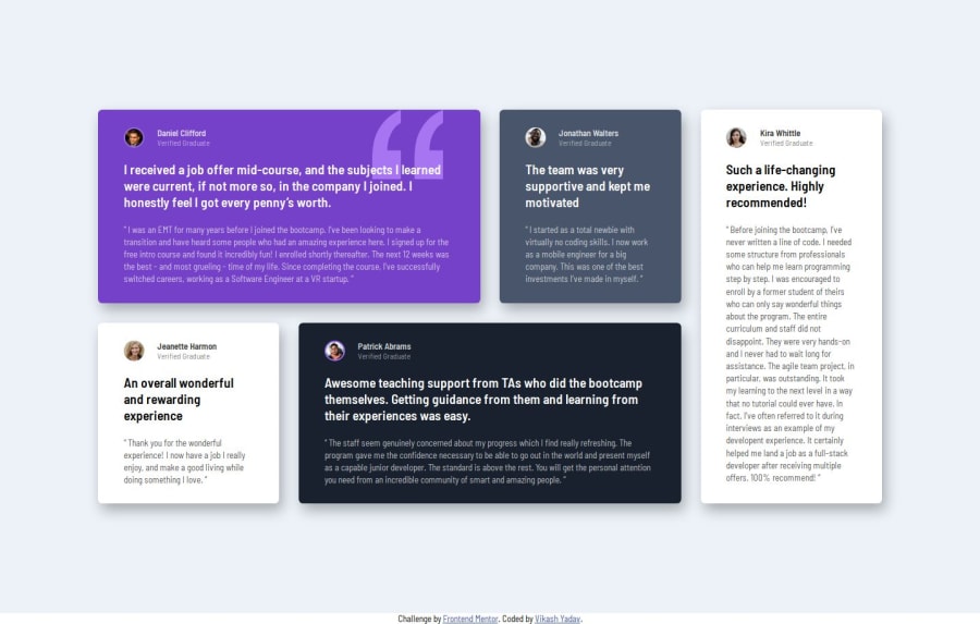
What challenges did you encounter, and how did you overcome them?- I got stuck in setting the quotes behind the content in the first box. I used pseudo elements such as
::beforeand::afterbut couldn't do it then saw some solutions of others. It was easy, I was just making it difficult. At the end I used background-image without pseudo element. Next time, first I will try to do these types of things without::beforeand::after. - One more there was some extra space in the bottom div but i was able to overcome it by asking in the discord. (Setting
grid-template-rowsto auto)
- I always get confused what to name the classes which are same like multiple boxes or items. For this project I have written item-one, item-two, .... Is it alright to use these class names.
- Next there's this
box-shadowI never get it right same as the design. If anyone have some tips on this please do share.
Community feedback
- @gmagnenatPosted 9 months ago
Hi and congrats on completing the challenge !
The result looks nice as a first sight, so congrats for that !
As you ask about accessibility i'll try to focus on this. It's a subject i'm very interested in. Accessibility is a lot about correct HTML.
Does the solution include semantic HTML?
- You are missing a <main> element
- I would just use an <img> element for the profile picture. not an empty div with a background image which doesn't tell anything to a screenreader for example.
- You should use <p> for your text content for name and title so it has a semantical meaning.
- You should have only one h1 per page then use lower level heading. You can probably use h2 for the item headings.
- You can use the blockquote element for the quote.
- The attribution items could be put in a <footer> element
Is it accessible, and what improvements could be made?
-
it scale correctly when the browser font-size is increased
-
Eveything should be included in a landmark. missing <main> as mentioned above.
Does the layout look good on a range of screen sizes?
- it looks good
Is the code well-structured, readable, and reusable?
HTML and class names
- About class names. Instead of "item-one" "item-two" you can use :nth-of-type() in your css and you just keep the item class.
- Same thing for "img-one" "img-two"... just use the <img> element with the correct image so you don't need these classes. Much simpler to handle and see what is happening.
- Instead of generic class names like "title" which could be a lot of different things if I don't know the code. Try to check some CSS methodology like BEM for example. the name classe could be something like author__name
CSS
- You need a modern CSS reset at the beginning of your stylesheet for browser consistency. Check out Josh Comeau or Andy Bell they both have a good modern CSS reset.
- The background pattern for the quote could be just added to an extra class. So you could move it to another quote for example.
- Using better classnames will help a lot to organise this and make it much more maintainable.
- If you work mobile first I don't think you need to set a min and max media query
Does the solution differ considerably from the design? The solution respects the design intention.
Things I liked to see
- good use of font sizes in rem
- min-height and max-width
- relative unit in media queries
I hope you find something useful to in these comments to improve your solution and your future challenges. Don't hesitate to ask on discord if some of the points here are unclear.
Happy Coding !
Marked as helpful1@Raptor0x1Posted 9 months agoThanks for such a detailed and useful feedback.
Keeping all the things you have pointed out I'll refactor my code. It's helping me a lot. But I like to ask something about using <main> element. When this testimonials component will be used in a website there would already be a <main> element after the <header>. Inside the <main> element, <section> will come. So should I still use <main> in the current code enclosing the <section>? @gmagnenat
1@gmagnenatPosted 9 months ago@Raptor0x1 sure, you want to add a <main> element in all your project to help indicate the browser where the main content is. Even in these projects its a good habit to take and doesn't change anything to the rest of the code.
1
Please log in to post a comment
Log in with GitHubJoin our Discord community
Join thousands of Frontend Mentor community members taking the challenges, sharing resources, helping each other, and chatting about all things front-end!
Join our Discord

