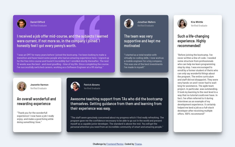
Design comparison
SolutionDesign
Solution retrospective
Please provide your feedback and suggestions.
Community feedback
- @Esesosa-maxPosted over 1 year ago
- ✅ Responsive 3/5 (Look Good on Desktop)
- It does look on mobile because the padding of the
testimonial containeris too much try dropping to2:remfor mobile
- It does look on mobile because the padding of the
- ✅ Good Usage of Flexbox and CSS Grid 5/5
- 🆗 Pixel Perfect on Desktop but fix the Mobile 3/5
- ✅ Animations 4/5
- 🆗 HTML Structure Could be better 3/5
Marked as helpful1@Tiyana19Posted over 1 year agoThank you so much @Esesosa-max can you please tell me, what you mean by fixing pixels in mobile (in point 3) and also how can I improve the HTML structure?
0@Esesosa-maxPosted over 1 year ago@Tiyana19 Point 3 is referred to how is not responsive on mobile otherwise it will be pixel-perfect. Instead of having two
<p>elements just making the other one a<h3>instead of giving a class ofhighlighted-pMarked as helpful1@Esesosa-maxPosted over 1 year ago@Tiyana19 Did you actually add the
padding:2remthat I told you to do? because I checked again it is thereMarked as helpful1 - ✅ Responsive 3/5 (Look Good on Desktop)
Please log in to post a comment
Log in with GitHubJoin our Discord community
Join thousands of Frontend Mentor community members taking the challenges, sharing resources, helping each other, and chatting about all things front-end!
Join our Discord
