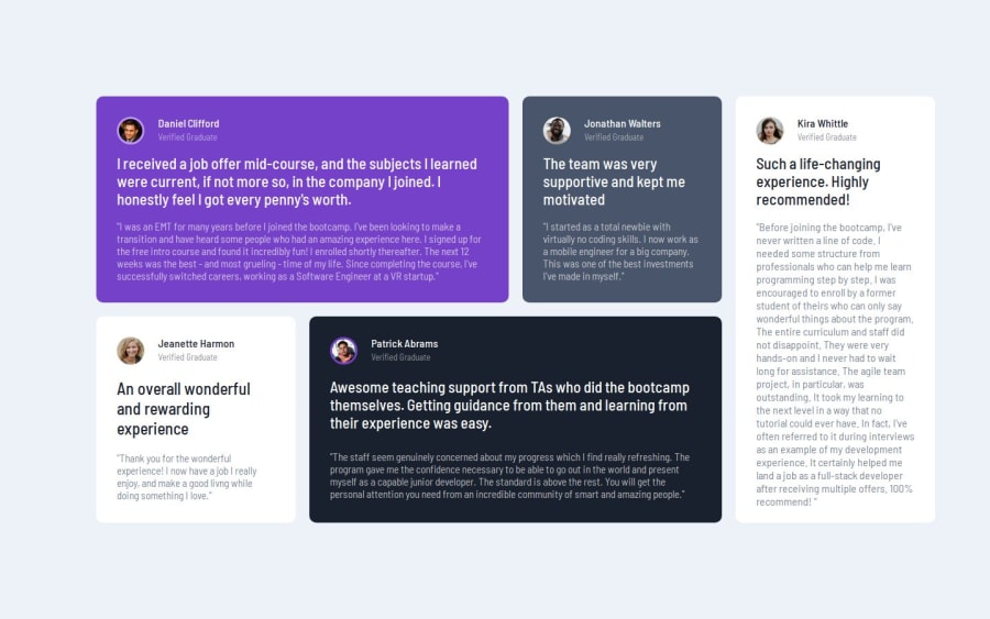


Design comparison

Solution retrospective
I am most proud of myself for completing and executing this challenge. Proud of how far I've come in this web development journey. Can't wait to face more challenges.
What challenges did you encounter, and how did you overcome them?The major challenge I encountered was using CSS Grid. I mixed up the execution part of the grid, I couldn't figure out if the widths of the cards should be determined by the grid itself or if I was supposed to specify the widths. In any case when you go through my code, you'll find out that the widths of the cards were determined by the grid. I'm open to more suggestions and tips and tricks on how to navigate my way with using CSS grid.
What specific areas of your project would you like help with?I think I might need some help positioning the big quotation icon at the background of the first card. I totally forgot about it lol.
Community feedback
- @Alex-Archer-IPosted 10 months ago
Hi!
Well done, congrats with new challenge and new technique =)
But you haven't reached full potential of grid yet! You can directly tell elements inside grid which cells they should take.
For example, you have 4x2 grid. It is formed by lines.
  1       2       3       4       5
1 | - - - | - - - | - - - | - - - |
  |       |       |       |       |
2 | - - - | - - - | - - - | - - - |
  |       |       |       |       |
3 | - - - | - - - | - - - | - - - |
Not a best drawing, but something like that... Now you need to pace one of the elements inside your grid exactly in the first two cells.
.card {
    grid-column-start: 1;
    grid-column-end: 3;
    grid-row-start: 1;
    grid-row-end: 2;
}

Or shorter version

.card {
    grid-column: 1 / 3;
    grid-row: 1/ 2;
}
Notice that you should define the lines in which it'll be placed. This element will take exactly two first cells of the grid. So now you doesn't have to hardcode it's width or use positioning.
So, that it is. Hope that helps =)
0@Macnelson9Posted 10 months ago@Alex-Archer-I Got it man. I'll keep practicing. Thank you so much
0

Please log in to post a comment
Log in with GitHub
Join our Discord community
Join thousands of Frontend Mentor community members taking the challenges, sharing resources, helping each other, and chatting about all things front-end!
Join our Discord