Submitted over 1 year agoA solution to the Testimonials grid section challenge
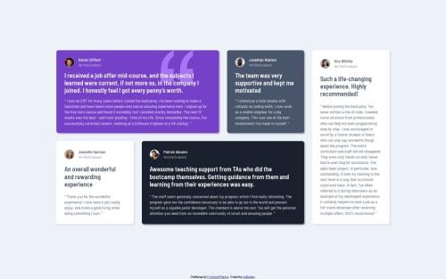
Responsive testimonials section using CSS grid
@nullpuppy

Solution retrospective
What are you most proud of, and what would you do differently next time?
I really like the effect I was able with a box-shadow that uses the testimonial card's colors, and the fairly fluid responsive layout at any resolution.
The biggest challenge I had here was the layout for the author name and avatar. I would have liked a little less markup, but I think what I came up with works pretty well.
What specific areas of your project would you like help with?Any feedback is appreciated. Thanks!
Code
Loading...
Please log in to post a comment
Log in with GitHubCommunity feedback
No feedback yet. Be the first to give feedback on Dustin Knie's solution.
Join our Discord community
Join thousands of Frontend Mentor community members taking the challenges, sharing resources, helping each other, and chatting about all things front-end!
Join our Discord