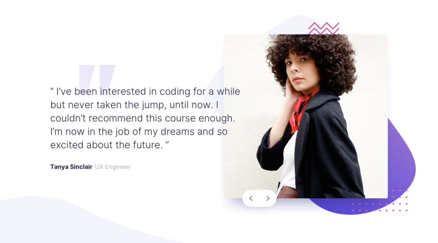
Design comparison
SolutionDesign
Solution retrospective
Any feedback welcome :)
Especially if you have any idea on how to code the slight shadow which highlights the button, I'd be glad to hear about it. My shadow goes above the background of the image, doing an ugly white stuff, that you can see, depending on the width.
Community feedback
- @llennairekPosted almost 4 years ago
Hi Nicolas,
About the shadow, you should use the other color of the style guide. Just for example this is what I used for the challenge and it seems ok:
box-shadow: 0 50px 50px -50px hsl(240, 38%, 20%);
Feel free to try it
Have fun coding!
0
Please log in to post a comment
Log in with GitHubJoin our Discord community
Join thousands of Frontend Mentor community members taking the challenges, sharing resources, helping each other, and chatting about all things front-end!
Join our Discord
