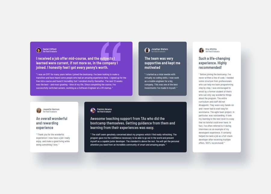
Responsive Testimonials Grid with Dynamic Layout Transitions


Design comparison

Solution retrospective
I am most proud of successfully implementing a responsive grid layout that adapts seamlessly across different screen sizes, while maintaining a clean and organized CSS structure using custom properties. The semantic HTML structure also ensures good accessibility. For future projects, I would implement CSS Grid fallbacks to support older browsers, utilize CSS custom properties for media query breakpoints, and explore CSS Grid's auto-fit/auto-fill properties for more dynamic layouts.
What challenges did you encounter, and how did you overcome them?The main challenge was positioning the quotation mark background image correctly across different screen sizes, which I solved by implementing specific background-position values for each media query breakpoint. I also struggled with maintaining consistent spacing between cards, but overcame this by developing a comprehensive spacing system using CSS custom properties. Additionally, ensuring proper text contrast across different colored backgrounds was challenging, but I addressed this by creating a well-thought-out color system with appropriate contrast ratios.
What specific areas of your project would you like help with?I would appreciate guidance on optimizing the responsive breakpoints for smoother transitions between layouts, reducing CSS specificity and redundant code for better performance, and implementing smooth animations during grid layout changes between different screen sizes.
Community feedback
- P@TurtlewordsPosted 14 days ago
The page is responsive and accurate to the layout. The code is very readable and includes semantic HTML. Great use of css variables.
1

Please log in to post a comment
Log in with GitHub
Join our Discord community
Join thousands of Frontend Mentor community members taking the challenges, sharing resources, helping each other, and chatting about all things front-end!
Join our Discord