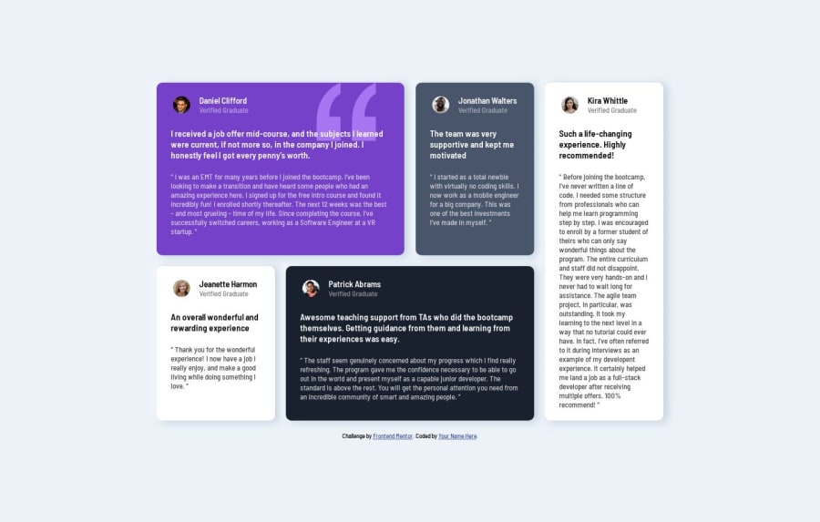
Responsive Testimonials grid section with HTML and CSS Grid
Design comparison
Solution retrospective
I was able to get it right for desktop using grid, I have put this on my css to make my main section a grid, where all the grid elements are in
display: grid;
grid-template-columns: repeat(4, 250px);
grid-gap: 1.5rem;
margin-bottom: 20px;
}
and used the following code to make the grid section aligned as required on the challenge
.grid-1 {
grid-column: span 2;
background: hsl(263, 55%, 52%) url(../images/bg-pattern-quotation.svg);
background-repeat: no-repeat;
background-position: top right 50px;
}

.grid-2 {
background-color: hsl(217, 19%, 35%);
}

.grid-3 {
grid-row: span 2;
background-color: hsl(0, 0%, 100%);
color: black;
}

.grid-4 {
background-color: hsl(0, 0%, 100%);
color: black;
}
as you can see I have used span to decide the width of each element, But my question is how can I make this responsive either without media query or using it? This is my first time using grid and it got me confused a bit.
Community feedback
- @vanzasetiaPosted almost 2 years ago
Hi, Melaku! 👋
I try this on my developer tool:
main {
display: grid;
/* grid-template-columns: repeat(4, 250px); */
grid-template-columns: repeat(auto-fit, minmax(min(100%, 250px), 1fr));
grid-gap: 1.5rem;
margin-bottom: 20px;
}
If you try it, you will see that the layout will be responsive without media queries. But, it is not good enough.
You still need to prevent the
<main>keep growing. Also, since you can not control how it should behave on specific screen sizes, it may not be possible to make it responsive without media queries.Anyway, I recommend giving it a try.
Here are a few suggestions for improvements.
- Do not use pixel unit for font sizes: Use
remoreminstead ofpxfor font sizes. Never usepxunit. Relative units such asremandemcan adapt when the users change the browser's font size setting. Learn more — Why you should never use px to set font-size in CSS - Do not change the
<html>or the:rootfont size: It can cause huge accessibility implications for those users with different font sizes or zoom requirements. Grace Snow explains the issue clearly—Should I change the default HTML font-size to 62.5%?—and Joshua Comeau also does not recommend that approach—The Surprising Truth About Pixels and Accessibility: should I use pixels or rems? - CSS reset: Use a CSS reset whenever you start a new project. This can help you set the styling foundation easily. My recommendation — A Modern CSS Reset | Andy Bell
I hope my feedback helps. Good luck with the grid layout! 😄
Marked as helpful1@MelakuAlehegnPosted almost 2 years ago@vanzasetia Thanks Venza, I did try this and was helpful, but I have added to the media query with some font size fixes and it was all good. Thanks for the feedback tho.
display:flex;
flex-direction: column;
0 - Do not use pixel unit for font sizes: Use
- @0xabdulkhaliqPosted almost 2 years ago
Hello there 👋. Congratulations on successfully completing the challenge! 🎉
- I have other recommendations regarding your code that I believe will be of great interest to you.
HTML 🏷️:
- This solution may cause accessibility errors due to lack of semantic markup, which causes lacking of landmark for a webpage and allows accessibility issues to screen readers, due to accessibility errors our website may not reach its intended audience, face legal consequences, and have poor search engine rankings, highlighting the importance of ensuring accessibility and avoiding errors.
- What is meant by landmark ?, They used to define major sections of your page instead of relying on generic elements like
<div>or<span>. They are use to provide a more precise detail of the structure of our webpage to the browser or screen readers
- For example:
- The
<main>element should include all content directly related to the page's main idea, so there should only be one per page - The
<footer>typically contains information about the author of the section, copyright data or links to related documents.
- So resolve the issue by replacing the
<div class="attribution">element with the proper semantic element<footer>in yourindex.htmlfile to improve accessibility and organization of your page
.
I hope you find this helpful 😄 Above all, the solution you submitted is great !
Happy coding!
1@0xabdulkhaliqPosted almost 2 years ago@MelakuAlehegn Glad you found it helpful ! 🤠
0
Please log in to post a comment
Log in with GitHubJoin our Discord community
Join thousands of Frontend Mentor community members taking the challenges, sharing resources, helping each other, and chatting about all things front-end!
Join our Discord
