Responsive Testimonials Grid Section Using SCSS


Design comparison

Solution retrospective
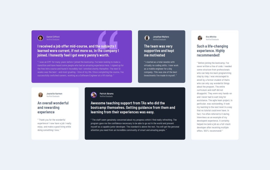
I almost missed the quotation background image. I'm glad I was able to add it and put it at the back of the texts.
What challenges did you encounter, and how did you overcome them?I estimated to finish this project in 8 hours but I needed a few more minutes because I had a difficult time figuring out the exact sizes and spacings. I'm still not sure if I used the correct values but I tried to make it look as close as possible to the given design images.
What specific areas of your project would you like help with?I would very much appreciate any suggestions that could improve my skills.
Please log in to post a comment
Log in with GitHubCommunity feedback
- @dar-ju
Hi Tel!
Great job! You did a good job with grids, used scss correctly. It's good that you measure time, it's important to accurately report deadlines.
I looked at your layout, there are several comments:
- on desktop, more than 1024px the main block is adjacent to the edges of the screen. In this project, it is better to use side paddings.
- at a screen resolution of 780 pixels and around this, the content goes beyond the top of the page. This needs to be fixed. The reason is that you set a fixed height for the main block
height: 100vh;. - for the decorative image "quote" you allocated a separate div block, this can be done for the testimonial section
- semantically, it is more correct for this task to make the entire block one section, and inside the section, the article blocks
- you use styles in separate files, which means there should be no styles in html, move the width of the images to the style file. This will make the code easier to maintain.
Otherwise everything is great, good luck with your developments!
Marked as helpful

Join our Discord community
Join thousands of Frontend Mentor community members taking the challenges, sharing resources, helping each other, and chatting about all things front-end!
Join our Discord