Design comparison
Solution retrospective
👋Hello, Frontend Mentor coding community.
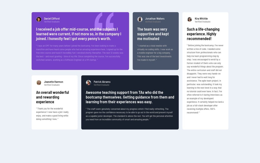
👨🏼💻This is my solution for the Testimonials Grid Section.
- Completely responsive
I'll be happy to hear any feedback and advice!🤗
Community feedback
- @ricoomPosted about 1 year ago
Hello Nehal, Congratulations for completing the challenge. I would like to point out however that using CSS grid to layout the cards would have saved you a lot of time and give you cleaner code. The real difference between using Flexbox and CSS Grid is in the amount of code: The code for creating a complex layout in Flexbox is more verbose, dispersed and hard to debug (as it being one dimensional you had to create several containers), while that created with the Grid (two dimensional layout) is much faster, tidier and simpler. Though flexbox performance may be high in complex scenarios, the performance difference is almost negligible. Note: I don't mean flex is bad, in fact you need both to achieve this, I just meant for this specific challenge grid would be good, notwithstanding browser support for flexbox is broader than the latter. I hope you find this insight helpful. Happy coding!!😉
Marked as helpful1@NehalSahu8055Posted about 1 year ago- Thanks @ricoom pointing this out. I never used grid in my projects.
- I will redo this problem using grid layout.
1
Please log in to post a comment
Log in with GitHubJoin our Discord community
Join thousands of Frontend Mentor community members taking the challenges, sharing resources, helping each other, and chatting about all things front-end!
Join our Discord
