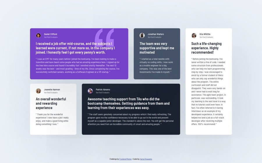
Responsive testimonials grid section using CSS Grid


Design comparison

Solution retrospective
Getting used to using CSS grid in a project. CSS grid is so powerful to overcome complex design.
What challenges did you encounter, and how did you overcome them?The spacing between elements inside the testimonial card is not the same between one another.
Have not figure out what the efficient ways to set the spacing, besides setting it one by one in each card.
What specific areas of your project would you like help with?What if we want the layout to change dynamically when the viewport change? Is it achievable by using CSS grid or should use flexbox?
Community feedback
- @dar-juPosted 4 months ago
You did a great job!
There are no errors in the code, no errors in the BEM.
Look at the 770px resolution, some columns are too thin, you need to do something about it, for example, move the last column down.
Below 770px there is too much space around the content, make the cards
with: 100%;and the padding as needed.Sorry, but I can't answer your questions, need more details about what exactly you are talking about.
Really great work, keep up the good work!
Marked as helpful2P@hartashuPosted 4 months ago@dar-ju Thanks a lot for the detail review of the code and such a good advice for the middle device's screen size. I will try to revise the code as what you suggest 😊
I found that the padding is different in each card in the figma file, so I think maybe there is an efficient way to set the padding besides setting one by one for each card.
And also the padding is different from one screen size with another screen size. Is setting the padding with media query is the only way or is there another efficient way?
Thanks 😊
0@dar-juPosted 4 months ago@hartashu
Unfortunately, I don't use figma. But if the designer has clearly specified incorrect sizes, then it's worth telling the designer or the project customer about it. If there is no such possibility, as in this case, then it's better to correct the sizes.
Indentation inside the block is used padding, indentation of blocks from each other if flex is used, then this is a gap, in your case everything is done correctly. And yes, indentations are adjusted with media query.
0P@hartashuPosted 4 months ago@dar-ju Okay. Thanks a lot for the feedback, make me more confident for the padding usage 👍
0

Please log in to post a comment
Log in with GitHub
Join our Discord community
Join thousands of Frontend Mentor community members taking the challenges, sharing resources, helping each other, and chatting about all things front-end!
Join our Discord