Responsive Testimonials Grid Section Solution using CSS Grid


Design comparison

Solution retrospective
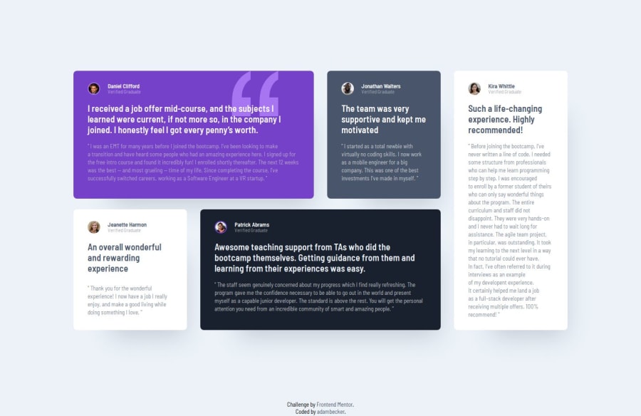
I’m most proud of how well I utilized CSS Grid to create a responsive and structured layout for the testimonials section. The grid-based design turned out visually appealing and functional across different screen sizes.
Next time, I would focus on achieving a more pixel-perfect design that matches the provided layout exactly. Additionally, I’d like to explore using CSS Grid shorthand properties to make the code more concise and maintainable.
What challenges did you encounter, and how did you overcome them?One of the biggest challenges I faced was aligning and positioning the grid items to match the exact layout from the design file. Ensuring consistent spacing and alignment took some time and testing.
I overcame this by referencing resources like the CSS Grid Cheat Sheet by Malven and adjusting grid properties incrementally. Testing the layout on different screen sizes also helped refine the design.
What specific areas of your project would you like help with?- Pixel Perfection: I’d love feedback on how to fine-tune the layout to match the design file perfectly.
- Accessibility: Are there additional ARIA attributes or semantic improvements I could add?
- CSS Grid Optimization: Any suggestions for writing more concise and efficient grid-based code?
Thank you in advance for any insights and feedback! 😊
Community feedback
- @dar-juPosted 4 months ago
Hi Dias!
I checked your code for errors - everything is great! You did a great job with the grid and even made 3 transition points, which is appropriate for this task. The code is well structured, there are base comments in the CSS. You divided the images correctly by semantics.
Regarding the heading tags, they need to be corrected. In these cards, the headings are the main excerpt from the comment. But due to the large length, you can make it as a paragraph and it will not be an error. Everything else - the names of the authors, their role, these are not headings, use <span> for this.
Pixel Perfect is implemented perfectly! Nothing to add here.
Overall, this is one of the best works on the Testimonials Grid task that I have seen. You are great!
Marked as helpful0P@adambeckercodesPosted 4 months ago@dar-ju Hi there! 👋
Thank you so much for taking the time to review my code and for your kind words—it truly means a lot to me! 😊
I’m glad you liked the grid setup and found the structure well-organized. I’ll definitely take your advice about the headings and adjust them accordingly.
Thanks again for your encouragement and support! 🙌
1

Please log in to post a comment
Log in with GitHubJoin our Discord community
Join thousands of Frontend Mentor community members taking the challenges, sharing resources, helping each other, and chatting about all things front-end!
Join our Discord