Design comparison
Solution retrospective
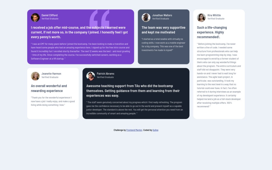
I completed 3rd Project on my 3rd day. I purely used Grid to build it. Kindly go through and give me feedback.
Please log in to post a comment
Log in with GitHubCommunity feedback
- @grace-snow
Hi, on mobile for me content is spilling out of the cards. All the rows need to be auto throughout this challenge really.
Other thing I notice is in html your heading semantics don't make sense at the moment. Headings have to go in order and need to make sense as headings for the content below them. Imagine them on a contents page - that's what search engines and screenreaders see. I'd recommend making the names into h2s and keeping all parts of the quote as paragraphs.
Hope that makes sense and is useful
Join our Discord community
Join thousands of Frontend Mentor community members taking the challenges, sharing resources, helping each other, and chatting about all things front-end!
Join our Discord
