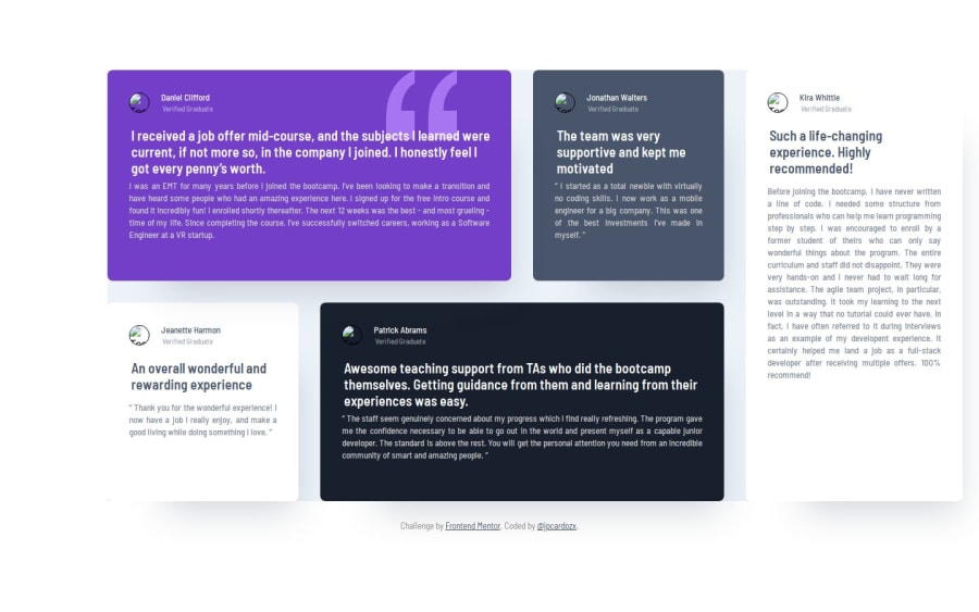
Responsive Testimonials Grid Section | Advanced HTML & CSS
Design comparison
Solution retrospective
I am most proud of the overall design and functionality of my project. The layout and styling came together well, and I was able to effectively implement responsive design principles to ensure the site looks good on various devices. I’m particularly happy with how I integrated the SVG elements to enhance the visual appeal of the cards.
Next time, I would focus more on optimizing the performance of the site, especially regarding image handling and code efficiency. While the design is solid, I noticed that image URLs sometimes lead to misalignment issues, and my approach to managing these assets could be more streamlined. I would also invest more time in testing across different devices and browsers to catch any inconsistencies early on.
What challenges did you encounter, and how did you overcome them?Aligning and positioning SVG elements correctly within the card layout proved difficult. I struggled with ensuring the SVGs did not overlap with text or other elements. I resolved this by using absolute positioning with careful adjustments of the top, left, width, and height properties. I also used the z-index property to manage stacking order and ensure the SVGs remained in the background.
Handling images in production was challenging, as images often appeared misaligned or with incorrect dimensions when viewed live. I addressed this by adjusting the image CSS rules and using responsive design techniques, such as setting appropriate max-width and height properties. I also researched best practices for image optimization to reduce file sizes without sacrificing quality.
These challenges helped me learn more about CSS positioning and responsive design, and I will apply these lessons to future projects to enhance my problem-solving skills.
What specific areas of your project would you like help with?Image Handling: I often encounter issues with images becoming misaligned or not displaying correctly when the site goes live. I’d appreciate advice on best practices for managing image assets in production, especially how to maintain consistency across different devices and screen sizes.
Code Optimization: My current method of handling image URLs leads to heavy code and potential performance issues. I’m looking for suggestions on how to streamline my code for better efficiency and how to implement best practices for image loading and display.
Community feedback
- @meandrewapriantoPosted 8 months ago
hi jpcardozx. nice work already complete this challenge, for me. you should used a picture element and trying to used border. So you can get a perfect circle image with border around.
Here's the link for picture element, picture element
0
Please log in to post a comment
Log in with GitHubJoin our Discord community
Join thousands of Frontend Mentor community members taking the challenges, sharing resources, helping each other, and chatting about all things front-end!
Join our Discord
