Design comparison
Solution retrospective
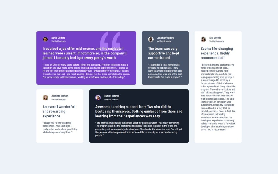
I am proud of working with grid, and position it like on providing design:)
What specific areas of your project would you like help with?Any feedback would be helpful :)
Community feedback
- @turtlethomPosted 8 months ago
Hey Yuliya, awesome grid layout. It's quite responsive and looks fantastic. Your usage of utility classes and CSS variables are great as well!
Just wanted to let you know that you could substitute some of the hard-coded values in your styling with the CSS variables you already defined. For example:
--Very-dark-grayish-blue: #48556a;

.light-card-text-color {
    color: #48556A;
/*Could be replaced with `color: var(--Very-dark-grayish-blue);` */
}
This can help make your codebase more extensible in the long term and is generally better practice, especially in larger, more long-term projects.
- You'd be able to change the color in the
:rootand be able to change it everywhere else. Another area I saw was here:
.card {
    color: white;
    padding-top: 26px;
    padding-left: 32px;
    padding-right: 32px;
    padding-bottom: 32px;

    border-radius: 8px;
    margin-bottom: 24px;
}

/*Can be condensed into this*/
.card {
    color: var(--White);
    padding: 26px 32px 32px;
/* top, left & right, bottom */

    border-radius: 8px;
    margin-bottom: 24px;
}
Just a few areas I saw that you could change to write less code. I'm just nitpicking those few things, but the presentation of the content is on point! I hope this information helps and again, great work as always :)
Marked as helpful1 - You'd be able to change the color in the
Please log in to post a comment
Log in with GitHubJoin our Discord community
Join thousands of Frontend Mentor community members taking the challenges, sharing resources, helping each other, and chatting about all things front-end!
Join our Discord
