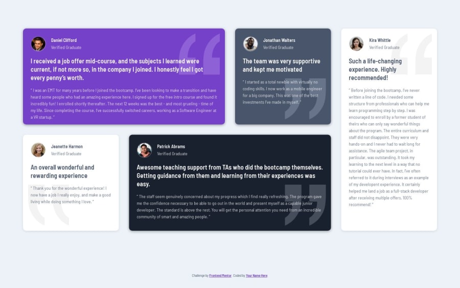
Design comparison
SolutionDesign
Solution retrospective
What are you most proud of, and what would you do differently next time?
That i managed to build up a solution only with grid and that i didn't use grid-areas.
What challenges did you encounter, and how did you overcome them?For a real responsive and fluid adjustment of the grid the different testimonials cards have to adjust individual. Using the grid-template-columns with a repeat, autofill and minmax combination helped alot
What specific areas of your project would you like help with?I hate using "!important" inside CSS. Maybe someone could help and show me a solution where i could get rid of this property.
Join our Discord community
Join thousands of Frontend Mentor community members taking the challenges, sharing resources, helping each other, and chatting about all things front-end!
Join our Discord
