Design comparison
Solution retrospective
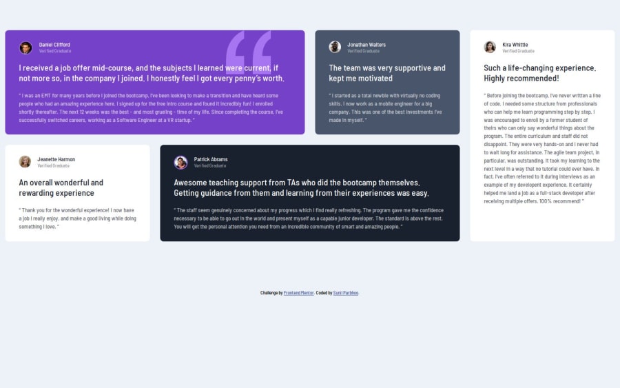
I enjoyed practicing CSS Grid. I utilized the grid for the desktop layout of the card elements, however I think next time I may try using it for the card itself (elements inside the card).
What specific areas of your project would you like help with?I am always open for any insights on how to make my code more professional and always open to hearing how I can improve.
Community feedback
- @chenmeisterPosted 5 months ago
Overall, the solution for the CSS Grid looks like the design provided. However, I've noticed the width of the entire testimonials grid covers up the entire screen. What I would suggest is to add a
width: min(95%, 70rem)to the.containerclass in your CSS File. That way it would give the container some width padding without having to stretch across the screen. Also, the best way to debug if your flexbox code is working is to utilize chrome dev tools and click on the icon next todisplay: flex;for your specified CSS class. Keep up the good work!0
Please log in to post a comment
Log in with GitHubJoin our Discord community
Join thousands of Frontend Mentor community members taking the challenges, sharing resources, helping each other, and chatting about all things front-end!
Join our Discord
