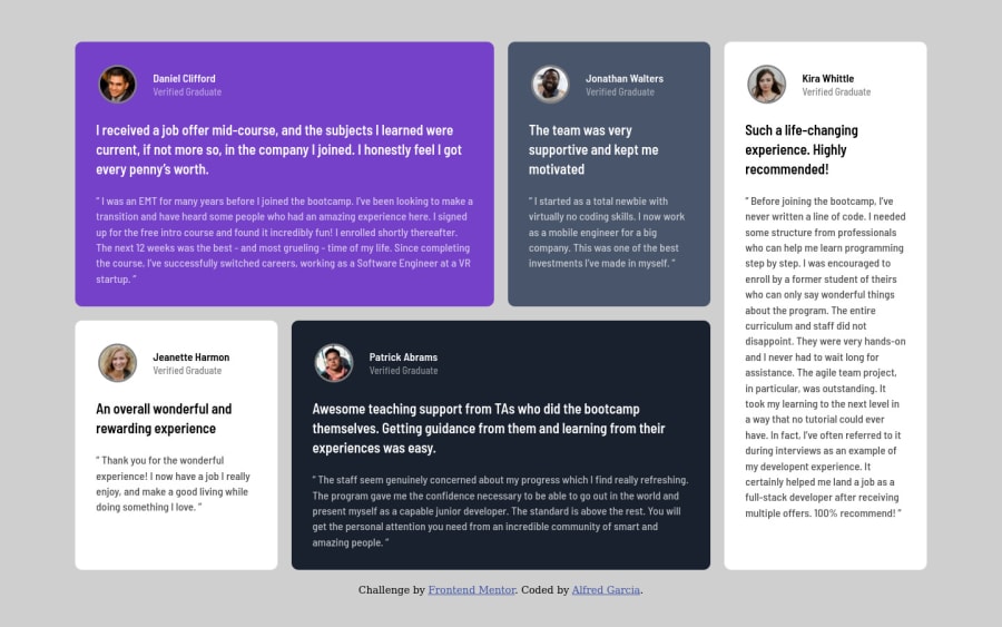
Design comparison
Solution retrospective
Please take a moment to review my code and let me know how I can improve. I feel like I need the most help in selecting class names that make sense. I tried using the BEM naming convention but I don't feel like I have it just right yet.
Anyway, looking forward to any advice folks are willing to provide.
Community feedback
- @correlucasPosted over 2 years ago
👾Hello Alfred Garcia, Congratulations on completing this challenge!
You've missed the color for the background, in this case is
background-color: #EDF2F8and add it to the body.Something you can do is to improve your html markup using meaningful tags and replacing the divs. In this case, for example the main block/div that takes all the content can be wrapped with
<main>or section, if you think about = the cards you can replace the<div>that’s wrapping each card with<article>you can wrap the paragraph with the quote with the tag<blockquote>this way you'll wrap each block of element with the best tag in this situation. Note that<div>is only a block element without meaning, prefer to use it for small blocks of content inside bigger blocks wrapped with some better markup.Here's a complete guide for HTML semantic TAGS: https://www.w3schools.com/TAgs/default.asp`
The approach you've used to center this card vertically is not the best way, because using margins you don't have much control over the component when it scales. My suggestion is that you do this alignment with
flexboxusing the body as a reference for the container.The first thing you need to do is to remove the margins used to align it, then apply
min-height: 100vhto make the body height size becomes 100% of the screen height, this way you make sure that whatever the situation the child element (the container) align the body withdisplay: flexandalign-items: center/justify-items: center.body { min-height: 100vh; background-color: var(--neutral-light-gray); display: flex; flex-direction: column; align-items: center; justify-content: center; }✌️ I hope this helps you and happy coding!
Marked as helpful0@Alfred-GarciaPosted over 2 years ago@correlucas Great feedback! I just implemented the suggested changes on my end. Thank you so much!
1 - @OhSorrowPosted over 2 years ago
Hey dear Alfred! Congratulations for completing this challenge 👏
I suggest you using
qelement for short quotes, andblockquoteelement for long quotes.Happy coding :)
Marked as helpful0@Alfred-GarciaPosted over 2 years ago@OhSorrow Thank you for the feedback! I just implemented it.
1
Please log in to post a comment
Log in with GitHubJoin our Discord community
Join thousands of Frontend Mentor community members taking the challenges, sharing resources, helping each other, and chatting about all things front-end!
Join our Discord
