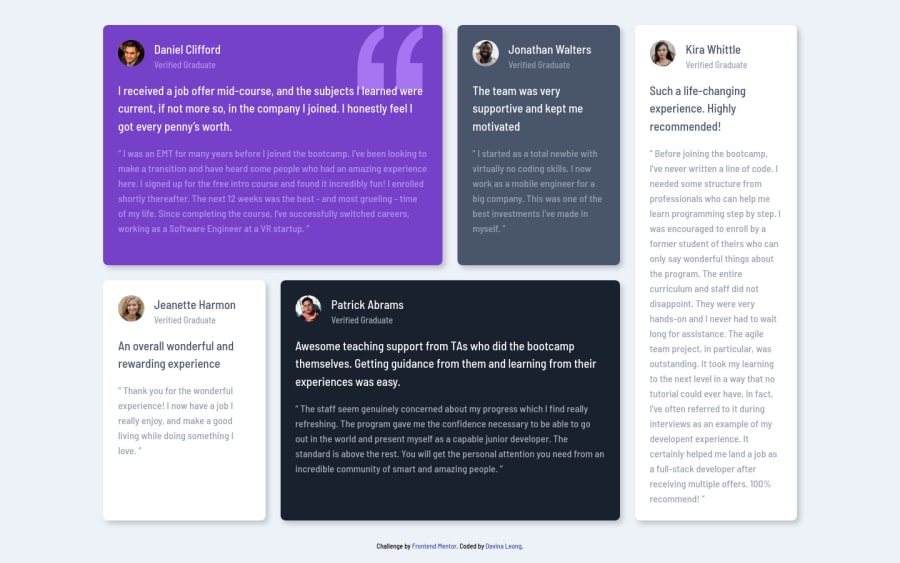
Design comparison
Community feedback
- @correlucasPosted over 2 years ago
👾Hello Davina, Congratulations on completing this challenge!
I saw your preview site and I liked a lot the work you’ve done here, it's almost complete, I’ve some suggestions you can consider applying to your code:
1.Don't forget to use the
alttext to allow screen readers to recognize that img. Adding alternative text to photos is first and foremost a principle of web accessibility. Visually impaired users using screen readers will be read an alt attribute to better understand an on-page image.<img src="./images/image-daniel.jpg" class="cell-avatar">2.The box-shadow is a bit too evident, this is due the
opacityandblur. The secret to create a perfect and smooth shadow is to have low values foropacityand increaseblurtry this value instead:box-shadow: 12px 7px 20px 6px rgb(57 75 84 / 8%);3.Improve your html markup using meaningful tags and replace the important blocks of content with better tags, for example the main div that takes all the content can be wrapped with
<main>or section, the cards you can be replaced the<div>that wraps each card with<article>you can wrap the paragraph with the quote with the tag<blockquote>this way you'll wrap each block of element with the best tag in this situation. Don’t usedivfor the important blocks, ever prefer some tag that shows what its containing the block.Here's a complete guide for HTML semantic TAGS: https://www.w3schools.com/TAgs/default.asp
✌️ I hope this helps you and happy coding!
0
Please log in to post a comment
Log in with GitHubJoin our Discord community
Join thousands of Frontend Mentor community members taking the challenges, sharing resources, helping each other, and chatting about all things front-end!
Join our Discord
