Submitted over 3 years ago
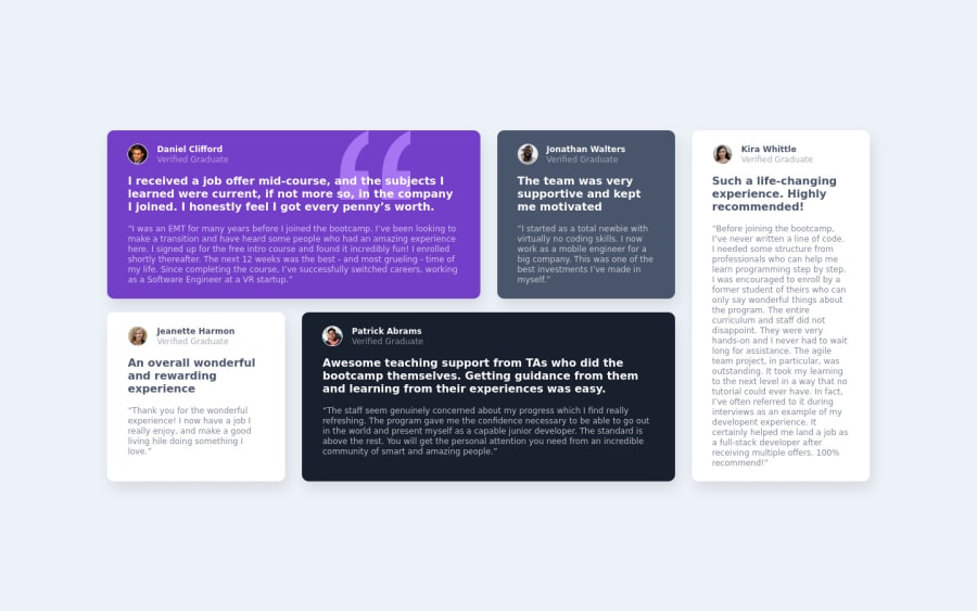
Responsive Testimonials Grid
@Kevin-Curruchich
Design comparison
SolutionDesign
Please log in to post a comment
Log in with GitHubCommunity feedback
- @vanzasetia
👋 Hi Kevin!
🎉 Congratulations on finishing this challenge! I have some feedback on this solution:
- Good Practice (Recommended)
- Why would you have two CSS files? By having two CSS files, you are forcing the users to download two CSS files which can impact the loading speed. I would recommend having one CSS file and using
@mediaquery in your CSS file. By doing that, you can prevent yourself from repeating the same code.
- Why would you have two CSS files? By having two CSS files, you are forcing the users to download two CSS files which can impact the loading speed. I would recommend having one CSS file and using
/* styles.css */ * { padding: 0; margin: 0; box-sizing: border-box; } html { font-size: 62.5%; font-family: 'Barlow', sans-serif; } body { background-color: rgba(237, 242, 248, 100%); } /* desktop.css */ * { padding: 0; margin: 0; box-sizing: border-box; } html { font-size: 62.5%; font-family: 'Barlow', sans-serif; } body { background-color: rgba(237, 242, 248, 100%); }- Accessibility
- I noticed that all the profile pictures are having
Danielas the alternative text. I would recommend fixing this issue by writing each individual's name for each picture. - For any decorative images, each
imgtag should have emptyalt=""andaria-hidden="true"attributes to make all web assistive technologies such as screen reader ignore those images. In this case, the quotes icon is a decorative image. - The quotes icon is a decorative image because it doesn't add any meaning or information to the page which means that if the quotes icon doesn't exist, the user still can understand the page content.
- To learn more about images and alternative text, you can read the tutorial from W3C WAI.
- Always wrap text content with meaningful tag (
pin this case). - Only use
divandspanfor styling purposes (not as the main wrapper of the text content). - Changing the root(html) font size can have a negative impact on users. There's no need to think about how much
1reminpx. An accessibility expert (Grace Snow) has said something about this.
- I noticed that all the profile pictures are having
- CSS
- I would recommend making the
bodyelement as a flex container to make all the elements perfectly in the middle of the page.
- I would recommend making the
/** * 1. To make the child element vertically * on the center and allow the body * element to grow if needed. */ body { display: flex; align-items: center; justify-content: center; min-height: 100vh; /* 1 */ background-color: rgba(237, 242, 248, 100%); }- About the quotes icon, you might find it easier to use CSS
backgroundproperties to position it correctly.
That's it! Hopefully, this is helpful!
Marked as helpful - Good Practice (Recommended)
- @codezeloss
Great job man!!!
Bonus: if you want to center your grid container, add those lines to the main container:
- height: 100vh;
- display: flex;
- align-items: center; (to center it horizontally)
- justify-content: center; (to center it vertically)
Good luck (;
Marked as helpful
Join our Discord community
Join thousands of Frontend Mentor community members taking the challenges, sharing resources, helping each other, and chatting about all things front-end!
Join our Discord
