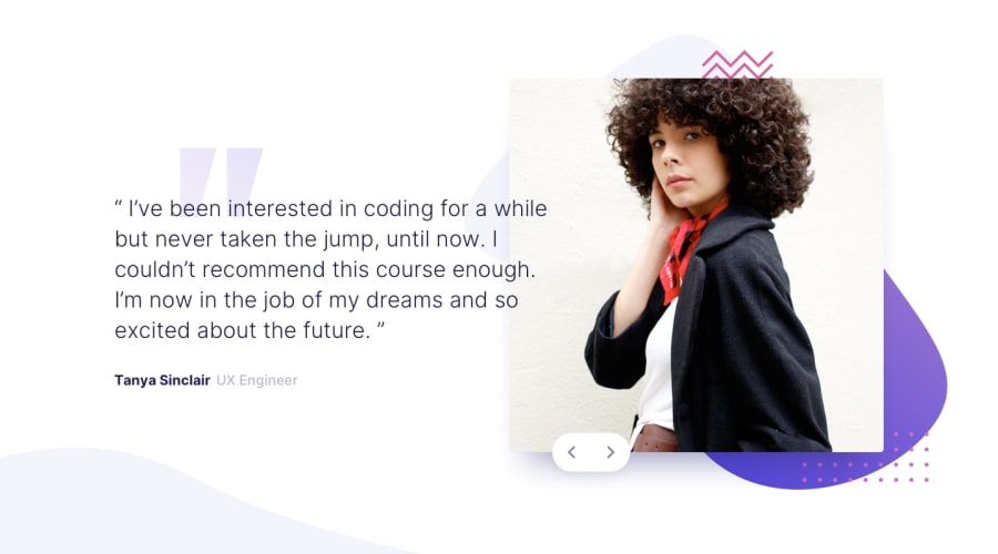
Design comparison
Solution retrospective
I should of gone mobile first on this project. I think that was my biggest mistake. Overall awesome experience. I struggled the most with the Javascript this time. I got the code to do what I wanted it to do. I just dont understand why it actually works. For my next project i really want to stop building and watch some best practice videos on refactoring and best practice. I also dont really use flexbox or grid as much as i think i should? Im not sure give me your thoughts on how you would of done this project or just some awesome feedback would be nice! have a good one!
Community feedback
- @MikeProducePosted about 2 years ago
I've been waiting for someone to comment on the
position: absoluteparts of my projects! I did not really know if that was the right thing to do or not but thank you for giving me more direction and clarifying that. I think the next challenge ill do I will focus on using flexbox/grid. I will definitely look over your code and follow your tips! thanks again on your amazing detailed feedback!0 - @elaineleungPosted about 2 years ago
Hi Miguel, great job completing this! Everything works as it should, and you also did well in hooking up the arrow keys to the buttons. As you mentioned, mobile-first is really the way to go, and I haven't met anyone who says otherwise.
I think the main thing to work on here is the positioning and responsiveness. I also found the positioning tricky, but the trickiest part for me was how to position things while making them all look good with one another and at different screen widths. I can see that mostly everything here is positioned using
position: absoluteand also with padding/margin. Doing that would cause the elements to be fixed to one location, and it also means the page only looks optimal at certain screen widths. In general, you'd want to only useposition: absolutefor certain elements that need to be fixed in relation to another bigger element, like the two button arrow keys.In my solution, I used mostly flexbox for position and
width: min()for the responsiveness. You can have a look at what I did in my solution here: https://www.frontendmentor.io/solutions/responsive-image-slidercarousel-built-with-scss-and-plain-js-aTsBq6SGAoA few other suggestions for you:
- Instead of using keycode (which is being depreciated), you can just use
event.key. - You can try a higher breakpoint because right now all the content to the right is covered by the browser once the layout changes. Not only that, at around the 500px breakpoint there's overlapping going on with the text, so you may want to see what's going on there.
- You can add
cursor: pointerto the buttons, as you'd always want to have a pointer for interactive elements to create a better user experience.
I think once you get more practice with using flexbox and grid, you should try this challenge again, and definitely always do a mobile-first approach! I highly suggest checking Kevin Powell's tutorials on YouTube as he's got a few where he does a Frontend Mentor challenge. Those are worth watching because you see his planning process and also how he structures the HTML and CSS along the way. Anyway, good luck, and keep going! 😊
0 - Instead of using keycode (which is being depreciated), you can just use
Please log in to post a comment
Log in with GitHubJoin our Discord community
Join thousands of Frontend Mentor community members taking the challenges, sharing resources, helping each other, and chatting about all things front-end!
Join our Discord
