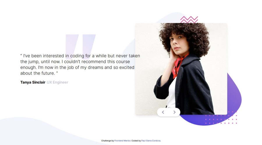
Responsive Testimonial Slide with Tailwind CSS and JS
Design comparison
Solution retrospective
I finally finished this. I started this two years ago, but I gave up because there were several things that I didn't know how to do, even I didn't know how to search doc about that things that I didn't know. But, never is late to retry... Here, I improved my skills using Tailwind. My knowledge of positioning with relative and absolute positioning attributes also improved. There were some attributes I had never used before, but I had to learn about those, and that was the best part.
Community feedback
- @Ezekiel225Posted 10 months ago
Hello there 👋 @PaulSierraFISI.
Good job on completing the challenge !
Your project looks really good!
I have a suggestion about your code that might interest you.
There is an very useful browser extension called Perfect Pixel that allow you compare with the design image and thus see the exact dimensions. I recommend it to you.
I hope this suggestion is useful for future projects.
Other than that, great job!
Happy coding.
1@PaulSierraFISIPosted 10 months ago@Ezekiel225 Thanks. I was not sure about using an static width and height for every device (mobile and desktop), that's why I did it with percentages, as you saw in the code.
So, my questions is: "How can I know when to use one instead of the another? (fixed and porcentuales measurements) "
0 - @IamVictheCGPosted 10 months ago
Your work and code are nice and dope, I like it. But, for convention's sake, I think it's best to use JSON for your data(ie: data.json not js)
0@PaulSierraFISIPosted 10 months ago@IamVictheCG Thank you for your comment.
1
Please log in to post a comment
Log in with GitHubJoin our Discord community
Join thousands of Frontend Mentor community members taking the challenges, sharing resources, helping each other, and chatting about all things front-end!
Join our Discord
