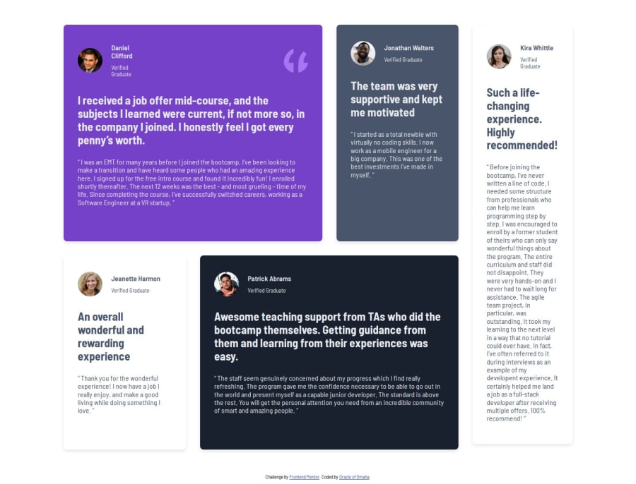
Responsive Testimonial section page using grid


Design comparison

Solution retrospective
I am most proud of my ability to identify the section colors correctly and to be able to get the structure of the sections right. Next time i would try using flex box to achieve same design.
What challenges did you encounter, and how did you overcome them?I had a great challenge in figuring out how to structure the sections for large screens using grid. My biggest challenge was placing the quotes image in the first section box.
What specific areas of your project would you like help with?Can someone help tell me how you figure out the width to set for your main container so that it matches that in the design files? and also how i can fit that quote image to blend in the background of the purple box. Thanks in advance
Community feedback
- @MaruchetOPosted 20 days ago
Great work! For the width of the container, I set it using
grid-template-columns: 1fr repeat(4, 254px) 1fr;, 254px is the width of the card. For the quotation image, the attributebackground-imagecan help with the design.0@Rodney-MokenyuPosted 20 days ago@MaruchetO thanks man. So for your container the total columns is 4 with each column having a width of 254/4 ?
0

Please log in to post a comment
Log in with GitHub
Join our Discord community
Join thousands of Frontend Mentor community members taking the challenges, sharing resources, helping each other, and chatting about all things front-end!
Join our Discord