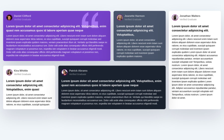
Design comparison
Community feedback
- @correlucasPosted over 2 years ago
👾Hi Wisdom Elendu, congrats on completing this challenge!
Nice solution and nice code! I can see that you paid a lot of attention to your code/design. If you don’t mind I’ve some tips for you:
Fix the alignment of the whole content using
flexandmin-heightto manage the vertical alignment and make everything centered.First of all putmin-height: 100vhto thebodyto make the body display 100% of the viewport height (this makes the container align to the height size that's now 100% of the screen height) size anddisplay: flexeflex-direction: columnto align the child element (the container) vertically using the body as reference.body { min-height: 100vh; font-family: Arial, Helvetica, sans-serif; font-size: 16px; line-height: 1.5; background-color: hsl(210, 46%, 96%); height: 80vh; display: flex; align-items: center; justify-content: center; flex-direction: column; }The html structure you’ve used here works, but if you want to make this even better, you can replace the
<div>you’ve used to keep the blocks and replace with some better html markup and semantic, for example, the main block can be wrapped with<main>and each testimonial card with<article>, then you can use a tag that not everyone knows, for the paragraph containing thequoteyou can replace the<p>with<blockquote>that is tag the describe exactly its content.This article from Freecodecamp explains the main HTML semantic TAGS: https://www.freecodecamp.org/news/semantic-html5-elements/
✌️ I hope this helps you and happy coding!
0
Please log in to post a comment
Log in with GitHubJoin our Discord community
Join thousands of Frontend Mentor community members taking the challenges, sharing resources, helping each other, and chatting about all things front-end!
Join our Discord
