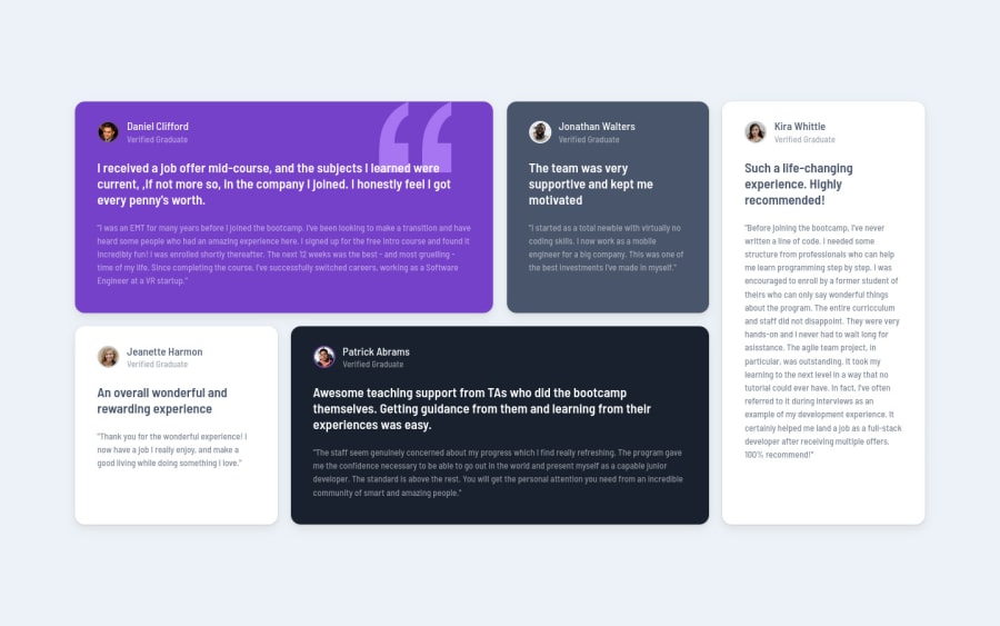
Design comparison
Solution retrospective
I wanted to practice using CSS Grids without looking at resources and I'm pretty happy with the result. Any feedback to improve my code is welcome!
Community feedback
- @correlucasPosted about 2 years ago
👾Hello Noel, Congratulations on completing this challenge!
I saw your solution preview site and I think it's already really good. Here’s some tips for you to improve it:
1.Note that currently your borders are too much rounded.Improve the card overall look adding the rounded borders to the component and also the image using
border-radius: 14px.2.Something you can do is to improve your html markup using meaningful tags and replacing the divs. In this case, for example the main block/div that takes all the content can be wrapped with
<main>or section, if you think about = the cards you can replace the<div>that’s wrapping each card with<article>you can wrap the paragraph with the quote with the tag<blockquote>this way you'll wrap each block of element with the best tag in this situation. Note that<div>is only a block element without meaning, prefer to use it for small blocks of content inside bigger blocks wrapped with some better markup.Here's a complete guide for HTML semantic TAGS: https://www.w3schools.com/TAgs/default.asp
✌️ I hope this helps you and happy coding!
Marked as helpful0@jayrnoelPosted about 2 years ago@correlucas Thank you for your feedback! I always forget to use semantic tags and when to use them though I am getting into the habit of using them.
1
Please log in to post a comment
Log in with GitHubJoin our Discord community
Join thousands of Frontend Mentor community members taking the challenges, sharing resources, helping each other, and chatting about all things front-end!
Join our Discord
