Design comparison
Solution retrospective
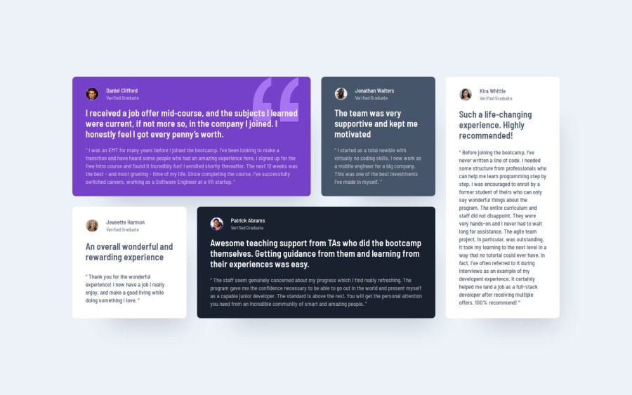
I tried to really make use of the benefits of the two layout tools ( flex and grid). I also tried to focus on readability and eas of editing if need be in the future. I tried to use the BEM notation properly and tried to keep the design as organized as possible and easily followable. Playing with the grids really helped my understnad how columns and rows in the layout work better
Community feedback
- @Leu3eryPosted 9 months ago
I'm just starting out in web development and I found your work very useful. Especially the use of variables and object placement
0P@ScarAgathorPosted 9 months ago@Leu3ery Thanks, I also just started about two months ago and I'm still learning the ropes. I'm glad my work was helpful to you.
0
Please log in to post a comment
Log in with GitHubJoin our Discord community
Join thousands of Frontend Mentor community members taking the challenges, sharing resources, helping each other, and chatting about all things front-end!
Join our Discord
