Submitted 10 months ago
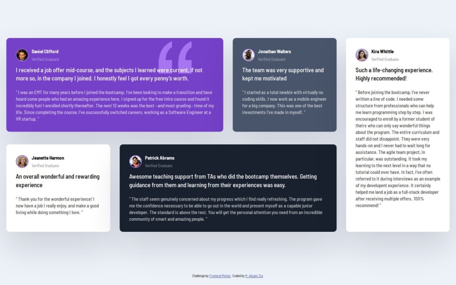
Responsive Testimonial landing page using CSS grid,flexbox
#pure-css
@abuzerexe
Design comparison
SolutionDesign
Community feedback
- @wotanutPosted 6 months ago
An excellent attempt, here's how you can improve:
- Add a bit of padding between the outside of the boxes and your content by adding
display: grid;
place-items: center;
To your body, it will also deal with centering your content.
- Try to use git more to version control your code instead of just having one commit.
- Your CSS has inconsistent spacing, try using a formatter such as prettier.
It may be of interest to you but Kevin Powell has a good tutorial on this solution. Other than these minor things, you did an excellent job, well done. :)
0
Please log in to post a comment
Log in with GitHubJoin our Discord community
Join thousands of Frontend Mentor community members taking the challenges, sharing resources, helping each other, and chatting about all things front-end!
Join our Discord
