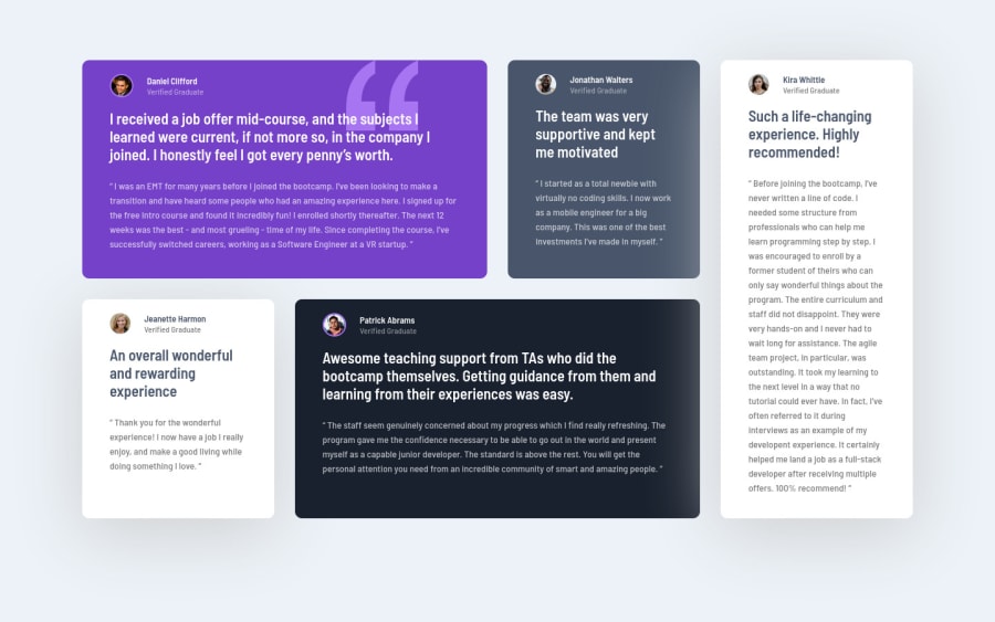
Design comparison
Solution retrospective
Let me know how it looks
Community feedback
- @correlucasPosted over 2 years ago
👾Hello Tom, congratulations for your solution!
I saw the work you did building the layout with grid and seems great, you've paid attention to the details. I liked a lots.
I've one tip for you about semantics and other about the design:
1.Maybe the best tag element to wrap these quotes is
<blockquote>because describes exactly what is inside of it, so you can replace the<p>with the<blockquote>for a better semantic marking.2.Note that the quote icon is a little bit too big and in the mobile version after
width: 300px;it starts to cover the section with the profile info, to solve that you should decrease one z-index level to get it under everything.Anyway, congrats for this amazing solution!
Hope it helps and happy coding!
Marked as helpful0@ComanderPotatoPosted over 2 years ago@correlucas Thanks I've only touched on the block level HTML and haven't been able to look at inline semantic elements so that is my next step, and I looked at it so many times couldn't tell whether it changed size responsively hahah but thank you slowly working on everything!!
1
Please log in to post a comment
Log in with GitHubJoin our Discord community
Join thousands of Frontend Mentor community members taking the challenges, sharing resources, helping each other, and chatting about all things front-end!
Join our Discord
