

Design comparison
SolutionDesign

Solution retrospective
What are you most proud of, and what would you do differently next time?
The CSS reset showed me a new way of accessibility handling of some animation issues.
Remove all animations, transitions and smooth scroll for people that prefer not to see them.
@media (prefers-reduced-motion: reduce) {
  html:focus-within {
    scroll-behavior: auto;
  }

  *,
  *::before,
  *::after {
    animation-duration: 0.01ms !important;
    animation-iteration-count: 1 !important;
    transition-duration: 0.01ms !important;
    scroll-behavior: auto !important;
  }
}
Plus, You can see i have used em instead of px unit in media queries, because it scales based on outside of HTML, and there are no issues with this.
@media screen and (min-width: 33em) {
  .testimonial-grid {
    grid-template-areas:
      "one one"
      "two three"
      "five five"
      "four four";
  }
}

@media screen and (min-width: 38em) {
  .testimonial-grid {
    grid-template-areas:
      "one one"
      "two five"
      "three five"
      "four four";
  }
}

@media screen and (min-width: 54em) {
  .testimonial-grid {
    grid-template-areas:
      "one one two"
      "five five five"
      "three four four";
  }
}

@media screen and (min-width: 75em) {
  .testimonial-grid {
    grid-template-areas:
      "one one two five"
      "three four four five";
  }
}
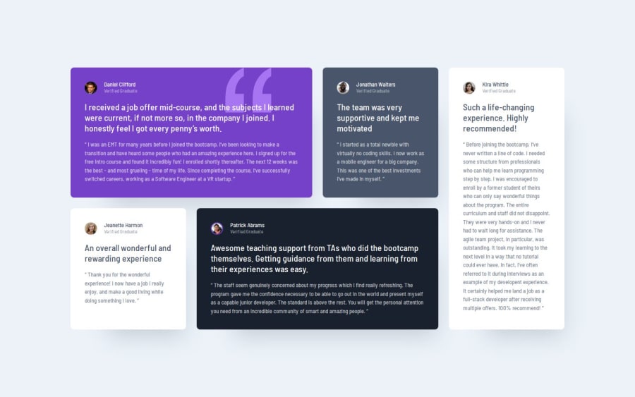
The Grid and line systems were confusing, but I overcame them by practicing.
Community feedback
Please log in to post a comment
Log in with GitHub
Join our Discord community
Join thousands of Frontend Mentor community members taking the challenges, sharing resources, helping each other, and chatting about all things front-end!
Join our Discord