Submitted 3 months ago
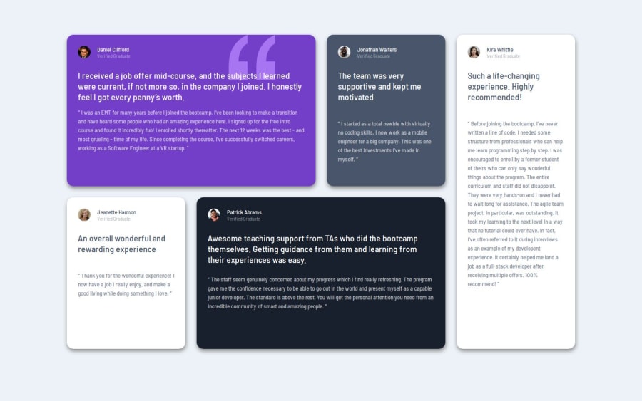
Responsive Testimonial Grid Section using CSS Grid and Flexbox

P
@the-Exalter

Design comparison
SolutionDesign

Community feedback
- P@kaamiikPosted 3 months ago
Hi. Some notes to improve your solution:
- You can check most of the pages and see they have a structure like this inside the
body:
<body>
  <header>...<header>
  <main>...<main>
  <footer>...<footer>
</body>
Based on your design you may have
headerandfooteror not. But You should have amainelement inside your page. So after your body always wrap all of your code inside amainelement. In this design you do not needheaderandfooter.- Firstly, profile images don't require
alttext, so you can leave thealtattribute empty. Additionally, avoid using words like image, picture, or photo in the alt text description, as users with screen readers are already aware that it's an image.
- Personally I think your
.highlightis a heading and a proper heading level ish2.
- For each card, you have a quote. Instead of using a
<p>tag for this, you can use the<blockquote>tag, which is more semantic and appropriate for this context. I also have a suggestion for your<blockquote>. One use case of the pseudo-classes::beforeand::afteris to add quotation marks before and after the text using the content property. This approach ensures that when selecting text with the mouse, the quotation marks are not included. Here is the code:
blockquote::before {
   content: '“';
/* Additional styling */
  }

 blockquote::after {
  content: '”';
/* Additional styling */
  }
- Try to use a proper CSS reset at the start of your CSS style. Andy Bell and Josh Comeau both have a good one. You can simply search on the internet to find them.
- Never limit your width and height in a container or element or tag that contains text inside.
When you limit the width and height of elements containing text, you risk the text being cut off,
overflowing, or becoming unreadable, especially on smaller screens or when the text dynamically changes.
It's generally better to allow the container to adjust its size based on its content or set a flexible
size that can adapt to different screen sizes and text lengths. You only need
max-widthhere because it prevents elements from stretching beyond a certain point, keeping them visually appealing across different screen sizes. It ensures your design remains adaptive and doesn't get too wide on larger screens.
- For your grid, it's better to use
repeat(4, 1fr)for your columns, or you can usegrid-auto-columns: 1fr;. For the rows, I noticed that your code is more complicated than necessary. You only need two rows, so avoid splitting them with percentage units. I also suggest usinggrid-template-areas, which is more suitable for this context. You can search and find the good resources to learn them on the net.
- Your
font-sizeandmax-widthshould be inremunit notpx. You can read this article about it and why you should not usepxas a font-size.
- you used many unnecessary codes in the media queries. Review your code and simplify it. It's not needed at all.
0 - You can check most of the pages and see they have a structure like this inside the
- @jsemenborodasPosted 3 months ago
Hello! You have some minor problems with the block sizes, but overall it looks pretty good.
0


Please log in to post a comment
Log in with GitHub
Join our Discord community
Join thousands of Frontend Mentor community members taking the challenges, sharing resources, helping each other, and chatting about all things front-end!
Join our Discord