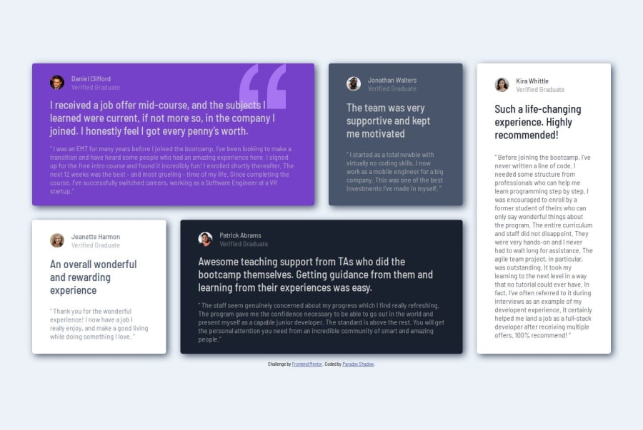
Design comparison
Solution retrospective
I was being able to use SASS for the first time. I must admit writing code with it is quite fun and easy. Just deploying it for the first time requires a bit of effort. It is not difficult, but for a lazy like me, it was just something extra that I wished I could skip.
What challenges did you encounter, and how did you overcome them?Surprisingly, this time, I did not face as many problems with the overall layout as with aligning the elements within the cards themselves. Just to get the alignment of a little area right, I had to write extra markup, but the other ideas I had were not responsive enough, so I had to settle on my current approach in the end.
What specific areas of your project would you like help with?Is it possible that I can simplify my project a bit? If there is any redundant HTML or CSS, I would like to eliminate it.
Community feedback
- @mdchongPosted 4 months ago
Great that it was your first time with SASS! I hope you enjoyed it. Just looking through your code, I was wondering why you decided to place the .review.highlight aside from the blockquote! I think it can be included inside the blockquote! (:
0@TarestaPosted 4 months ago@mdchong Thanks for your feedback. I do not have a particular reason for that. I did not think it through. Yes, maybe I can include them both in blockquote.
0
Please log in to post a comment
Log in with GitHubJoin our Discord community
Join thousands of Frontend Mentor community members taking the challenges, sharing resources, helping each other, and chatting about all things front-end!
Join our Discord
