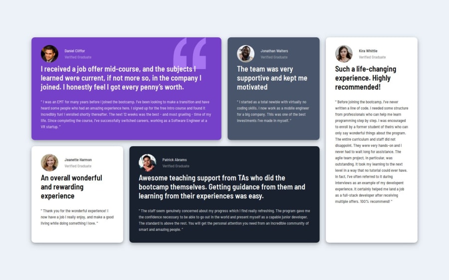
Design comparison
Solution retrospective
I am now learning now responsive css layouts, and as a part of this learning I took this project. I am very proud of positioning the whole body into center with max-width and max-height properties. Next time, I will remember it and do it firstly if it is required.
What challenges did you encounter, and how did you overcome them?I faced challenges to make the whole section center. And the most important thing is centering in other devices with media queries. Then I learned about max-width and min-height, and my confusion went out.
What specific areas of your project would you like help with?As I am in the learning phase now, I wish to get feedback about my design and code structure. Actually, I am not good at design, and as I did not get the Figma file, I might not do the spacing correctly like margin, padding etc. So, I wish to know my faults and go ahead too.
Community feedback
- @verakissyou17Posted 8 months ago
I think you have the wrong link in your submission.
Marked as helpful1@Sazid99246Posted 8 months ago@verakissyou17, Thank you for your comment. I just updated the correct link of the code.
0
Please log in to post a comment
Log in with GitHubJoin our Discord community
Join thousands of Frontend Mentor community members taking the challenges, sharing resources, helping each other, and chatting about all things front-end!
Join our Discord
