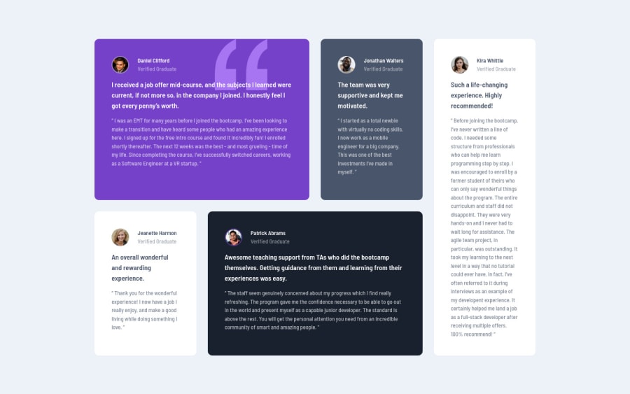
Responsive Testimonial Grid Layout Built With CSS Grid & Flexbox.
Design comparison
Solution retrospective
crazy thing is, this challenge was what made me decide to start building all these practice projects. i came accross this particular one from Kevin Powell's YouTube Channel and said "why not" then tried to build it and ended up spending 4 hours staring at the HTML markup being frustrated about not knowing what to do hehehe.
so i dedicated this month to taking on these challenges, and one by one with the help from all the feedback from everyone here (especially my friend, Lucas 👊🏽), I've learnt soo much and when i tried this project again, i built everything in less than half the time i spent staring at the HTML initially.
what do you guys think of my code in terms of readability, modularity and scalability. your comments have been really helpful in regards to my growth so i do always appreciated the feedback.
Community feedback
- @elaineleungPosted about 2 years ago
Great job, Johhny! I'm a fan of Kevin Powell and his work, and I'm happy to hear that Lucas has been helping you this month as you're working on challenges (I'm a huge fan of him as well 😊)
The one comment I have here is, when I'm resizing the browser and making it smaller, the cards become really squished, and the lines are almost unreadable. It think it's because of the
70%
you used in themin()
function that is putting so much whitespace around the grid. Instead ofwidth: min(70%, 75rem)
, trywidth: min(100% - 3rem, 63rem)
, which helps to keep that whitespace to a minimum (3rem
here means 1.5rem margins on both sides). I'd do the same for the breakpoint as well, where instead ofwidth: 70%
, I would trywidth: min(90%, 50rem)
.By the way, like you I also dedicated this whole month to building projects, and I can really see myself getting better, so let's keep going! 😊
Marked as helpful2@johnnysedh3llloPosted about 2 years agoHello Elaine, thank you for the feedback. I'm still trying to understand how to use CSS functions in general so I thought I'd do a little bit of practice with the min () function to atleast wrap my head around it a bit. hehe guess i need a little more practice. i do appreciate this tho. I'll put in the corrections soon.
oh and just as a side note: i found a repo of yours on GitHub ealier this month with all the HTML & CSS Frontend Mentor Practice Projects you built all in one repo with a landing page and i thought that was pretty intuative so i starred the repo as an inspiration. so yeah, I'm a fan as well. let's keep going forward and thanks again for the feedback.
1@elaineleungPosted about 2 years ago@johnnysedh3lllo Yes, keep practising! I learned about
min()
from Kevin, and it's totally changed my life, 😂 even though I spent quite a bit of time learning how to use it first, so yes, have fun experimenting as well! Also, happy to hear my repo is giving you some ideas on what to do 😊1 - @correlucasPosted about 2 years ago
Wooow Johnny, congratulations for all your progress until here and this amazing solution!
I followed this tutorial of Kevin Powell and was amazing, something you can check is the
css reset
its given in his files, its really good.I liked a lots of how much is responsive the whole solution and even more the second media query you've add changing the grid layout, this is really nice! You did pretty much everything working with the semantic tags, the only you've missed is the
<blockquote>
to replace thep
with the paragraph containg thequote
.Something you can do is to customize a bit your solution, for example give each card a
hover
effect, I did one for you:article:hover { filter: brightness(1.1); }
Keep it up and continue posting great solutions Johnny!
Marked as helpful1@johnnysedh3llloPosted about 2 years agohey Lucas, will get into implementing the corrections soon. thanks again for your kind words and all the feedback. you've been really helpful on my journey. i really appreciate you man.
1@johnnysedh3llloPosted about 2 years agooh i just remembered. Kevin's video was actually where i got the idea entirely of a CSS Reset and since i watched the video I've been using the one he used.
for the hover effect, i had the thought of trying out something like that for the next solution. but i can also try it out for this one too. bless, man.
1@correlucasPosted about 2 years ago@johnnysedh3lllo sooner I'll be asking help for you since noe you'll be doing challenges that I never done and you'll be my teacher hahaha 👾
1
Please log in to post a comment
Log in with GitHubJoin our Discord community
Join thousands of Frontend Mentor community members taking the challenges, sharing resources, helping each other, and chatting about all things front-end!
Join our Discord