Design comparison
SolutionDesign
Solution retrospective
Someone should please help me inspect my code.
Community feedback
- @MohammedBentalbPosted about 1 year ago
Nice work, yet it could be better here are some notes that you may take into consideration:
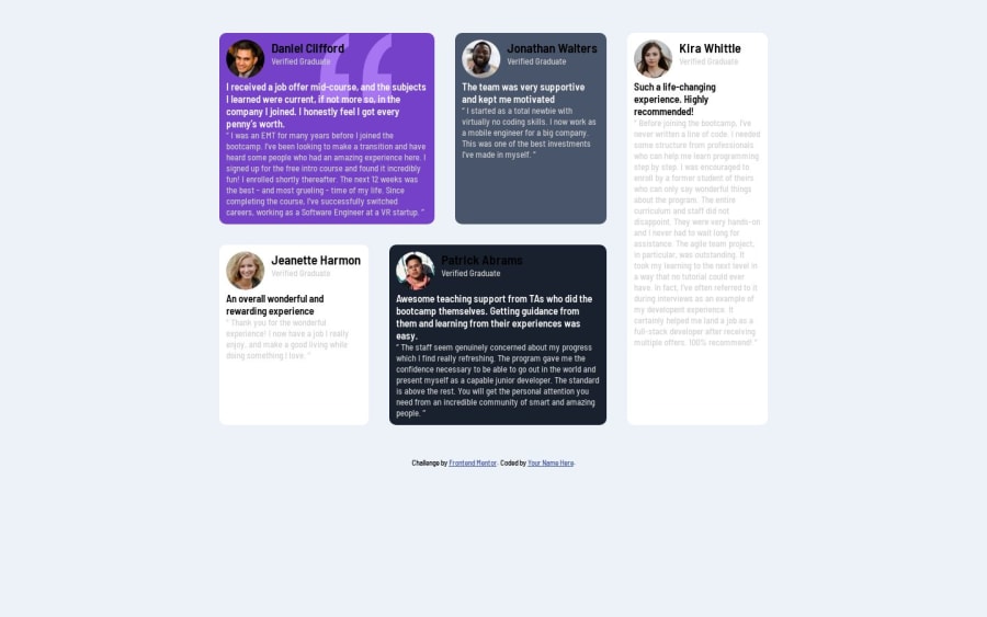
- Responsiveness: the break point where the layout gets back to its original state can still be made responsive consider adding more break points.
- Container width: in this case not defining the height of the container could be the best choice since (let it for grid) because the height of the cards vary and not stable/unified.
- fonts: the main goal here is to make the layout responsive, but tweaking the fonts a bit would help you have a better view of the items
Marked as helpful1
Please log in to post a comment
Log in with GitHubJoin our Discord community
Join thousands of Frontend Mentor community members taking the challenges, sharing resources, helping each other, and chatting about all things front-end!
Join our Discord
