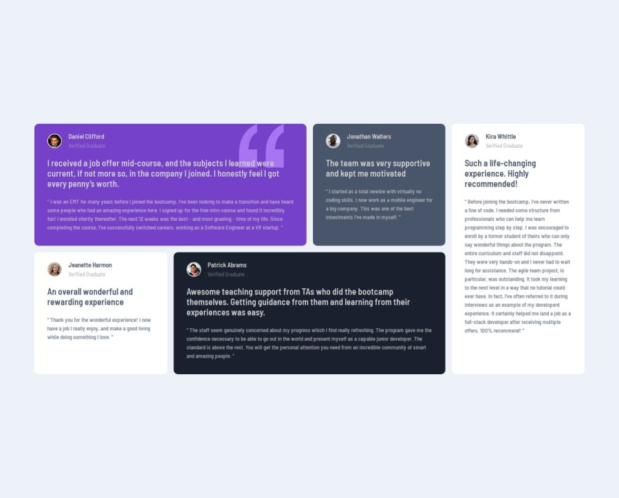
Design comparison
Solution retrospective
Nothing really
What challenges did you encounter, and how did you overcome them?Making my page responsive across all screen sizes, I later used flexbox for the screen of 600px and above.
What specific areas of your project would you like help with?I need more rigorous understanding of the grid layout
Community feedback
- @0xabdulkhaliqPosted 7 months ago
Hello there π. Congratulations on successfully completing the challenge! π
- I have a suggestion regarding your code that I believe will be of great interest to you.
FIXING ACCESSIBILITY ISSUES :
- Currently the
.item-head
part inside each card is not accessible,
<div class="user-badge"> <img src="images\image-daniel.jpg" alt="avatar" class="item-image"> <div class="item-name"> <h1 class="name">Daniel Clifford</h1> <span class="status">Verified Graduate</span> </div> </div>
- It's an important part to which needs to be properly announced to users who using accessibility devices, To make it properly accessible we need to use
figure
element with pair offigcaption
.
- Here's the example markup using
figure
andfigcaption
,
<figure> <img class="user-badge_image" src="./images/image-daniel.jpg" alt=""> <figcaption> <p class="user-badge_name">Daniel Clifford</p> <p class="user-badge_verification">Verified Graduate</p> </figcaption> </figure>
- On the above code we also fixed a major issue where with each of cards having
h1
elements for people names, because they are need to be used very wisely. We can't have more thanh1
element for a page, because it's primarily used to accurately describes the page's contents/purpose. So we instead use plainp
elements.
- If you have any questions or need further clarification then feel free to reach out to me.
.
I hope you find this helpful π Above all, the solution you submitted is great !
Happy coding!
Marked as helpful1@Sylvester009Posted 7 months ago@0xabdulkhalid Thank you very much.. This clears the issues of multiple h1 perfectly.
0 - @R3ygoskiPosted 7 months ago
Hello Samuel, I'd like to start by recommending a channel that helped me a lot in understanding grid layout: Slaying the Dragon - Grid.
What you did by using
flex
for smaller screens is not wrong, you made a good choice. We useflex
for one-dimensional alignment, meaning it aligns on only one axis, unlikegrid
, which is two-dimensional.One thing I noticed is that your cards aren't positioned as you defined in the grid area. You can correct this by:
.grid-container { /* previous properties */ grid-template-columns: repeat(4, 1fr); grid-template-rows: repeat(2, 1fr); } .item-no { max-width: 100%; }
Now they will follow the area you set.
Edit: To centralize your solution, just remove the
.grid-container
margin
, and in yourbody
, use adisplay:flex;
andheigth: 100vh;
If you need help with anything else, just ask here, and I'll try to help in the best way possible. Congratulations on your effort to complete the project; you used good techniques with the grid.
Marked as helpful0@Sylvester009Posted 7 months ago@R3ygoski, thank you very much for your help, I applied the corrections you provided, and it worked like magic. I will check out Slaying Dragon to get a better understanding of CSS grid. Thank you once again for your help.
1
Please log in to post a comment
Log in with GitHubJoin our Discord community
Join thousands of Frontend Mentor community members taking the challenges, sharing resources, helping each other, and chatting about all things front-end!
Join our Discord