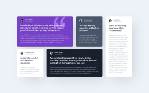
Responsive Testimonals Grid Section

Solution retrospective
Proud that I managed to get the desired grid layout.
Next time, I would plan it out ahead of time before starting the code.
What challenges did you encounter, and how did you overcome them?I resort to using flex by default, so made myself use grid for the entire layout.
No issues, just need more practice using grid layout.
What specific areas of your project would you like help with?Just overall code review and one question.
I understand that the accessibility report is highlighting that the page requires a single h1 tag.
In this instance, this isn't really a landing page, but another section and this is the reason I have not added any h1 elements.
Is this correct?
Thank you
Please log in to post a comment
Log in with GitHubCommunity feedback
No feedback yet. Be the first to give feedback on Branka R's solution.
Join our Discord community
Join thousands of Frontend Mentor community members taking the challenges, sharing resources, helping each other, and chatting about all things front-end!
Join our Discord