Design comparison
Solution retrospective
If I could get some feedback about best practices I would appreciate it a lot!
Community feedback
- @VCaramesPosted about 2 years ago
Hey there! 👋 Here are some suggestions to help improve your code:
-
Unless if your company requires you to use a library , I strongly suggest you stay away from using libraries until you fully grasp the fundamentals of HTML, CSS and JS. By using a library, you are robbing yourself from actually learning how to code.
-
To not only improve your HTML code but to also identify the main content of you page, you will want to wrap your entire component inside the Main Element.
-
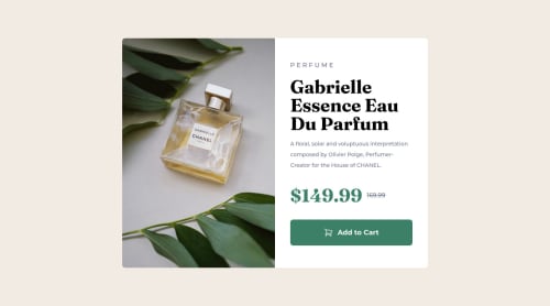
The image’s “Alt Tag” description needs to be improved upon to better describe what it is. You will want to assume that you are describing the image to a someone.
-
This component requires the use of two images 🎑 at different breakpoints. The Picture Element will facilitate this.
Here is an example of how it works: EXAMPLE
Syntax:
<picture> <source media="(min-width: )" srcset=""> <img src="" alt=""> </picture>
More Info:
https://www.w3schools.com/html/html_images_picture.asp
https://web.dev/learn/design/picture-element/
- Currently, the old price (169.99) 🏷 is not being properly announced to screen readers. To fix this, you are going to wrap the the price in a Del Element and inside it you will add a Span Element with an sr-only class that will state something like “The previous price was…” and use CSS to make it only visible to screen readers.
If you have any questions or need further clarification, feel free to reach out to me.
Happy Coding! 🍂🦃
Marked as helpful1@RelmaurPosted about 2 years agoHello @vcarames!... Thank you so much for your feedback! The response time here is impressive 😄... I did all the changes you suggested.
I was in the lookout for a platform like this... I'm very glad I came across it!
Best,
0@VCaramesPosted about 2 years ago@Relmaur
I just happened to log in at the same time you posted. Lol
You will learn a lot here.
I also suggest joining the Slack channel; You can ask question there as you're building your project (no need to wait until it's complete).
0@RelmaurPosted about 2 years ago@vcarames Already did joined it!... And I'll sure make myself present there.
Thank you again for your speedy answer, see you around, friend!
0 -
- @PhoenixDev22Posted about 2 years ago
Hi Marco Lizardo Del Riego,
Congratulation on finishing your first challenge.
Great job on this one! you have already received some helpful feedback which is nice to see , just going to add some suggestions as well if you don't mind:
- It's not recommended to capitalize in html, let css text transform take care of that. Remember screen readers won't be able to Read capitalized text as they will often read them letter by letter thinking they are acronyms.
- The cart image in the button is a decorative image. For decorative svgs, you set an
aria-hidden=”true”
andfocusable=”false”
to remove that element from the accessibility tree. This can improve the experience for assistive technology users by hiding purely decorative svgs.
- Adding
rel="noopener"
orrel="noreferrer"
totarget="_blank"
links. When you link to a page on another site usingtarget=”_blank”
attribute, you can expose your site to performance and security issues.
hopefully this feedback helps.
0
Please log in to post a comment
Log in with GitHubJoin our Discord community
Join thousands of Frontend Mentor community members taking the challenges, sharing resources, helping each other, and chatting about all things front-end!
Join our Discord