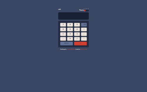
responsive tailwind css calculator

Solution retrospective
Hey there! I'm pumped to share more about my approach to the calculator app challenge. 😄 It was such a fun project to flex my HTML, CSS, and JavaScript skills!
For starters, I focused on setting up the markup to match the designs. Getting the structure down with semantic HTML5 elements really helped streamline the styling process later. I made sure to use header, main, footer tags, and ARIA roles for improved accessibility too.
On the CSS side, I relied heavily on Flexbox and Grid for layout from tailwindcss. This made it smooth sailing to get the numpad and display area aligned nicely across device sizes. I definitely learned some new tricks for responsively styling the range slider and toggle switch that I'll be sure to apply in future projects!
JavaScript was the real brain bender! 🧠 I used event listeners on the number buttons to build the display value string, and wrote logic for the math operators, delete button etc. The theme toggling gave me a chance to sharpen my DOM manipulation skills as well.
In terms of optimization, I tried to keep the JavaScript focused and modular. I probably could have split it out even further into logical files. And there's certainly room to improve performance by only updating specific DOM elements rather than full page re-renders. More to learn!
Let me know if you have any other feedback! thanks! 💪
Please log in to post a comment
Log in with GitHubCommunity feedback
No feedback yet. Be the first to give feedback on Gift Richard's solution.
Join our Discord community
Join thousands of Frontend Mentor community members taking the challenges, sharing resources, helping each other, and chatting about all things front-end!
Join our Discord