Responsive Sunnyside Landing Page with mobile navigation & grid layout

Solution retrospective
This is my 8th Junior Project! 🎉
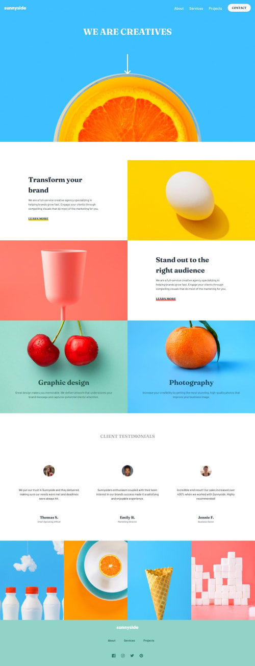
I really enjoyed making this website. I really loved the color scheme and the beautiful assets! I was able to make the website both accessible and responsive *with my current knowledge of things.
I used CSS grid to make the base layout of the website. With grid, it was really easy to make it on desktop and mobile. This is the first time I'm using a property order which I used to reverse the order of the grid. I found it on Stack Overflow and it actually worked.
I don't think I faced any big "difficulties". But, it was a bit confusing to create the background for the "Photography" and "Graphic Design". I tested it on my phone and the image seemed to be large in size and was not correctly positioned.
I didn't face this issue with the other images. But, these two have a small issue and I don't know why.
I didn't create the little navigation menu indicator(the little right triangle on the top left when the links are visible 😅) on mobile because it was a bit difficult with ::before pseudo element. So I left it.
Any suggestions on how I can improve are welcome! 😃
Please log in to post a comment
Log in with GitHubCommunity feedback
No feedback yet. Be the first to give feedback on Tharun Raj's solution.
Join our Discord community
Join thousands of Frontend Mentor community members taking the challenges, sharing resources, helping each other, and chatting about all things front-end!
Join our Discord