Design comparison
Community feedback
- @newbpydevPosted over 2 years ago
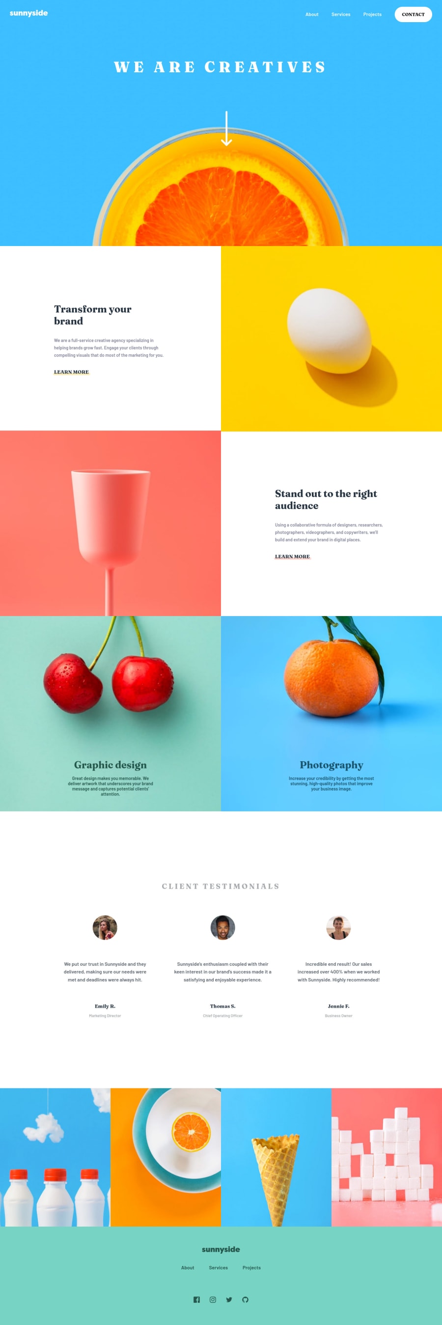
Excellent work, it is close to the result, just a quick recommendation, the font size of the headers and some of the background colors are a little off. The background of the 'white' areas has a hint of beige color. What I used to do is get the image of the designs and put it in Figma, then use the color picker to get the exact, or super close, version of the color used. While you are at it, if you make a frame with the size of the design you are using, then line up the sides you can get the exact dimensions of the font sizes and image sizes. It is a handy trick to know.
Marked as helpful1@siddhiePosted over 2 years ago@newbpydev Thank you for your valueable feedback!! I will update my solution.
0 - @newbpydevPosted over 2 years ago
One final note, about the landmarks, you must use the proper tags for example the
<header></header>
<main></main>
<footer></footer>
These are the landmarks, again it's all about the screen readers and those with disabilities, they will depend on the proper information. I noticed you used it in the footer, but there are more such as the header, navs and such. You used more div tags, so FrontEndMentor complains, which is good to help us think more about the users. if you decide to keep using divs you must give them a role, ex:
<div className="header" role="header">
This div will be considered a header, even though we didn't use the <header></header> tag.
</div>
I sometimes alternate between the div with roles and the actual tags just to experiment.
0 - @newbpydevPosted over 2 years ago
I see that in one of your problems is that you didn't wrap your
<li></li>code with a ul or an ol, remember that this is to help the screen readers identify your lists, ex:
<ul>
  <li>remember this is a list item</li>
</ul>
Another problem that arose were about the
<a>tags, if you take a look at your code, inside the a tags you don't have any text, so the text readers won't be able to help people with accessibility problems, we need to use the aria-label and you can add a label or description of where this link will take them, ex:<a aria-label="click me to learn more about my products" href="#"></a>0
Please log in to post a comment
Log in with GitHubJoin our Discord community
Join thousands of Frontend Mentor community members taking the challenges, sharing resources, helping each other, and chatting about all things front-end!
Join our Discord
