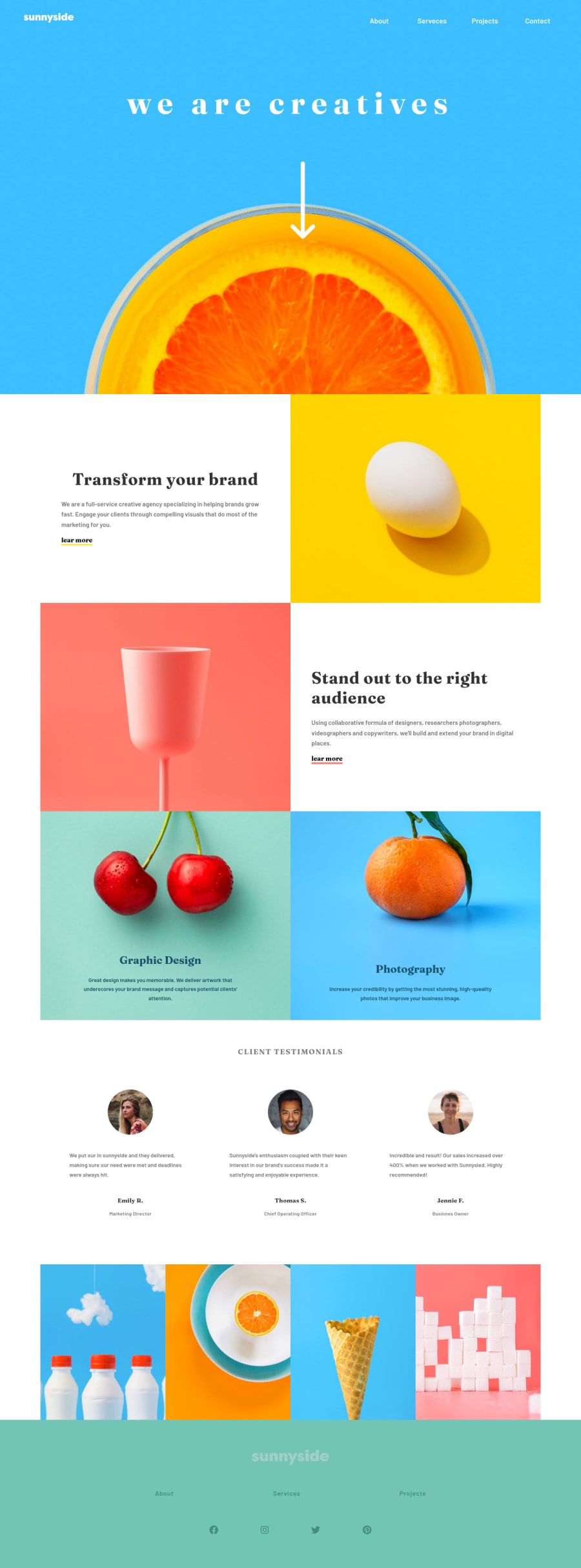
Design comparison
SolutionDesign
Solution retrospective
Any feedback is welcome.
Community feedback
- @Cyrus-Akwaboah-EmmanuelPosted about 2 years ago
Nice try with but don't normally use
display: flexon a body. You can wrap your your body in a<div class="container">and.container: display: flex;on it. Your images must have alternatives texts for accessibility<img src="flower.jpg" alt="flower">You can also get rid of themain{max-width: 1240px;}and usemain{width: 100%}instead. In wrapping your sections,article section{ justify-content: space-between;}will help get right of the excess white space.Marked as helpful1@ramedina98Posted over 1 year ago@Cyrus-Akwaboah-Emmanuel Thanks for the recommendation, I appreciate it.
0
Please log in to post a comment
Log in with GitHubJoin our Discord community
Join thousands of Frontend Mentor community members taking the challenges, sharing resources, helping each other, and chatting about all things front-end!
Join our Discord
