Submitted over 3 years ago
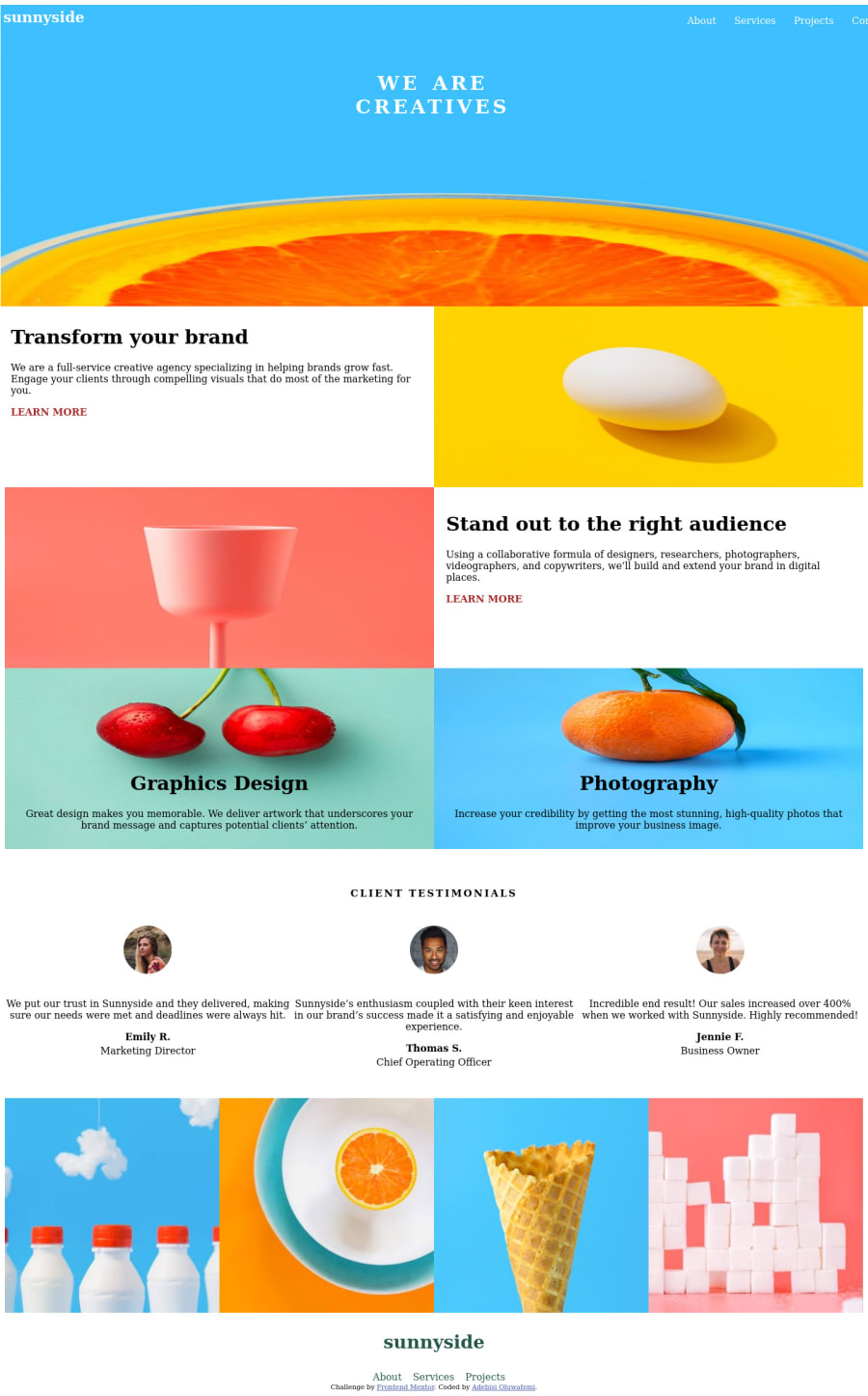
responsive sunny landing page using flex, grid and media
@Albusflames
Design comparison
SolutionDesign
Solution retrospective
please I need feedback on how to do the bottom color of the learn more link on the original design and also any form of correction will be of great help especially on the menu button
Please log in to post a comment
Log in with GitHubCommunity feedback
- @talentlessDeveloper
Hi Oluwafemi,
add a before pseudo class to your anchor tag something like this
 a::before {
   display: block;
  content: "";
  position: absolute;
  top: 0.6875rem;
 left: -0.25rem;
 width: 108%;
 height: 0.4375rem;
 opacity: 0.6;
 border-radius: 10px;
 z-index: -1;
background-color: yellow;
}
you can adjust the values and background-color as you see fit.
Welldone!
Marked as helpful - @Albusflames
Cool. That was helpful thanks alot.
Join our Discord community
Join thousands of Frontend Mentor community members taking the challenges, sharing resources, helping each other, and chatting about all things front-end!
Join our Discord
