Submitted 9 months ago
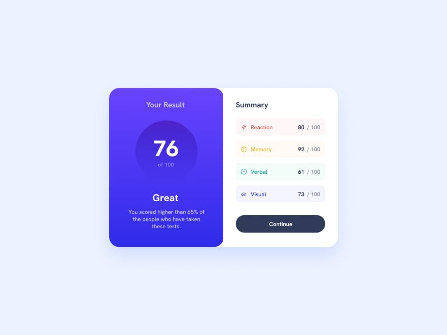
Responsive Summery Component using Grid
#accessibility
@nuraf9607
Design comparison
SolutionDesign
Solution retrospective
What are you most proud of, and what would you do differently next time?
Although it was pretty Great and I am satisfied with myself, I liked the way I did the responsive stuff and made it pretty much similar to the design file, and I started integrating grid more into my code which helped to simplify things, but there was blunder and I wrote things in repeat but I believe I will tackle this problem too in future
What challenges did you encounter, and how did you overcome them?There wasn't much of a challenge but I learnt few things, there is one in particular I didn't really overcome, I will mention it below
What specific areas of your project would you like help with?- I couldn't make the
buttontransition while hovering over them, I found online that there is a problem transitioning from still color to gradient, but I don't know how to solve it
Community feedback
Please log in to post a comment
Log in with GitHubJoin our Discord community
Join thousands of Frontend Mentor community members taking the challenges, sharing resources, helping each other, and chatting about all things front-end!
Join our Discord
