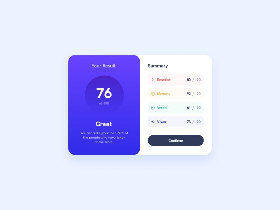
Design comparison
Solution retrospective
It was little tricky to make design responsible🧐. I used a lot of rem/em but than realise it was too much. I literaly didn't have any px values🥶 I'm quite confident about the code🧑💻. But I still far away from understanding best pratices for responsive design and mobile first approach⏳
Any feedback is much appreciated same for likes and follows. Let's get in touch and learn together🎉.
Community feedback
- @Antoine-thzPosted over 1 year ago
Hi,
I thin you can use more of display flex so your summary part will be more responsive and for less effort ( don't have to use position relative to each child of summary) try somethin like for your summary class :
display: flex; flex-direction: column; /* align-content: center; */ align-items: center; justify-content: space-evenly; }And be carrefull to small details like the border radius of the summary left bottom corner they are easy to correct but have a big impact to the design.You can also try to do some javascript by automatically calculate and display the average rate.
Good luck !
Marked as helpful0@Maksym-PaselskyPosted over 1 year ago@Antoine-thz thanks for feeback. Flex look more easy aprroach defenetly will use it in future
0
Please log in to post a comment
Log in with GitHubJoin our Discord community
Join thousands of Frontend Mentor community members taking the challenges, sharing resources, helping each other, and chatting about all things front-end!
Join our Discord
