Submitted over 1 year ago
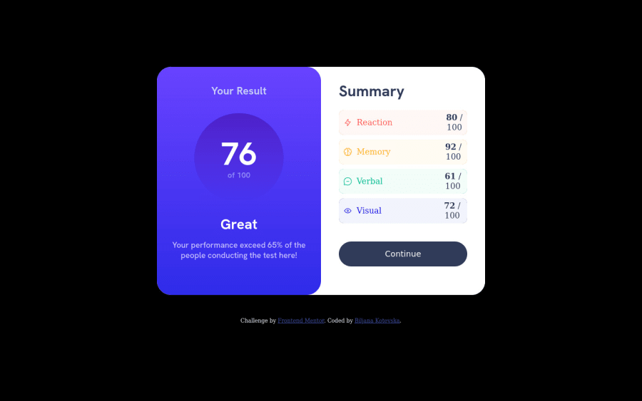
Responsive summary card using flexbox and grid
@BiljanaKotev
Design comparison
SolutionDesign
Solution retrospective
I had to add additional margin on the last 2 summary results because the words were smaller than the first 2. Not sure if there was a cleaner/better way to add the spacing?
Community feedback
- @0xabdulkhaliqPosted over 1 year ago
Hello there 👋. Congratulations on successfully completing the challenge! 🎉
- I have other recommendations regarding your code that I believe will be of great interest to you.
CSS 🎨:
- We don't want to use
marginto center the component both horizontally & vertically. Because usingmarginwill not dynamical centers our component at all states
- To properly center the component in the page, you should use
FlexboxorGridlayout. You can read more about centering in CSS here 📚.
- For this demonstration we use css
Gridto center the component
body {
    min-height: 100vh;
    display: grid;
    place-items: center;

    margin: 0;
}
- Now remove these style rules, to see the results.
main {
  margin: 0 auto;
  margin-top: 50px;
}
I hope you find it helpful 😄 Above all, the solution you submitted is great !
Happy coding!
Marked as helpful0
Please log in to post a comment
Log in with GitHubJoin our Discord community
Join thousands of Frontend Mentor community members taking the challenges, sharing resources, helping each other, and chatting about all things front-end!
Join our Discord
